Type and Image project
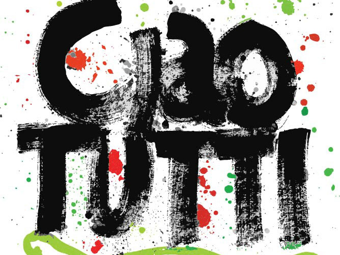
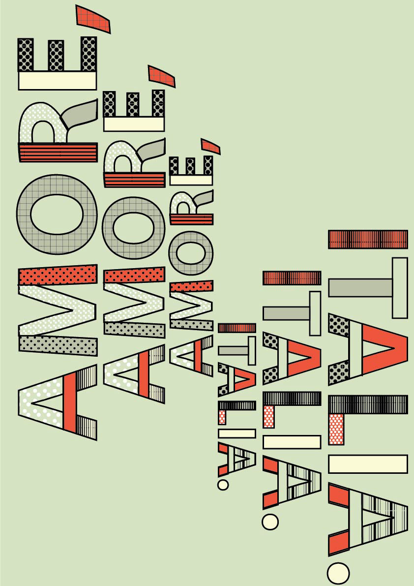
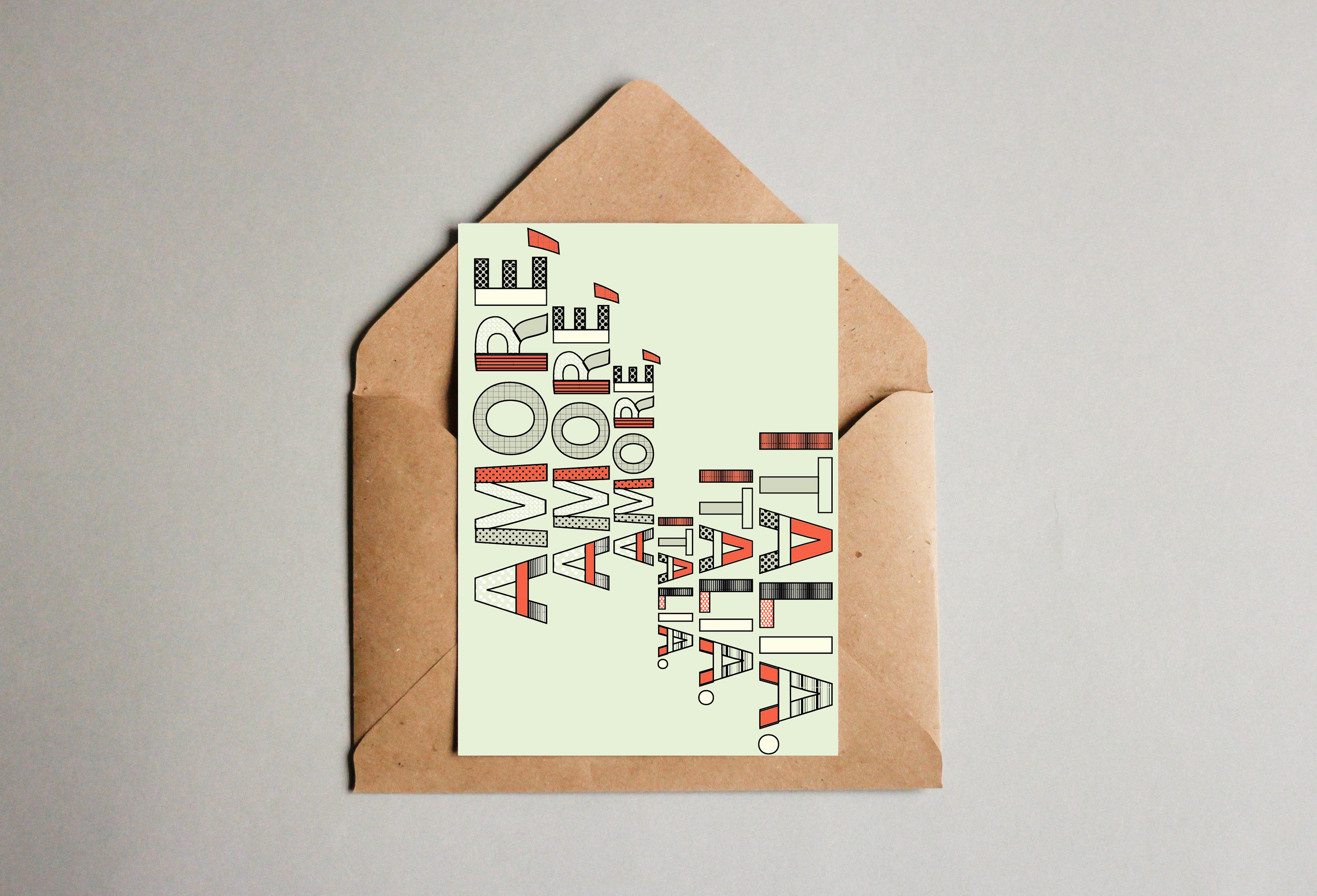
Inspired by the vibrant and playful work of artists Craig & Karl, I approached my Type and Image project with a focus on bold, graphic design elements. The project, which centred on Italy and Italian culture, provided a unique opportunity to blend typographic design with dynamic visual patterns that reflected the country's rich cultural heritage and lively aesthetic.
I began by creating a series of digital typographic compositions using Adobe Illustrator. Drawing upon the colourful, geometric style of Craig & Karl, I crafted bespoke letterforms that combined bold shapes and clean lines, ensuring a strong visual impact. From there, I further developed the designs by incorporating a variety of patterns—ranging from geometric to organic forms—along with a vibrant colour palette inspired by Italy’s iconic landscapes, architecture and art.
The addition of these patterns and colours not only enhanced the visual complexity of the type but also added layers of meaning, reflecting Italy's dynamic cultural landscape. The final result was a collection of typographic designs that merged contemporary digital techniques with the playful, expressive energy of Italian culture, creating a visually engaging and conceptually rich interpretation of the theme.
Type and Image project
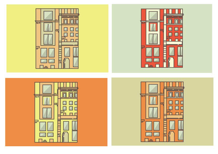
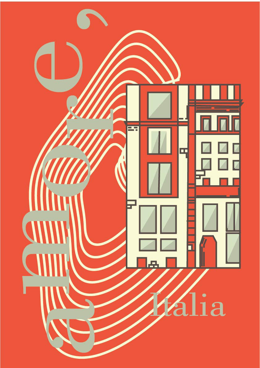
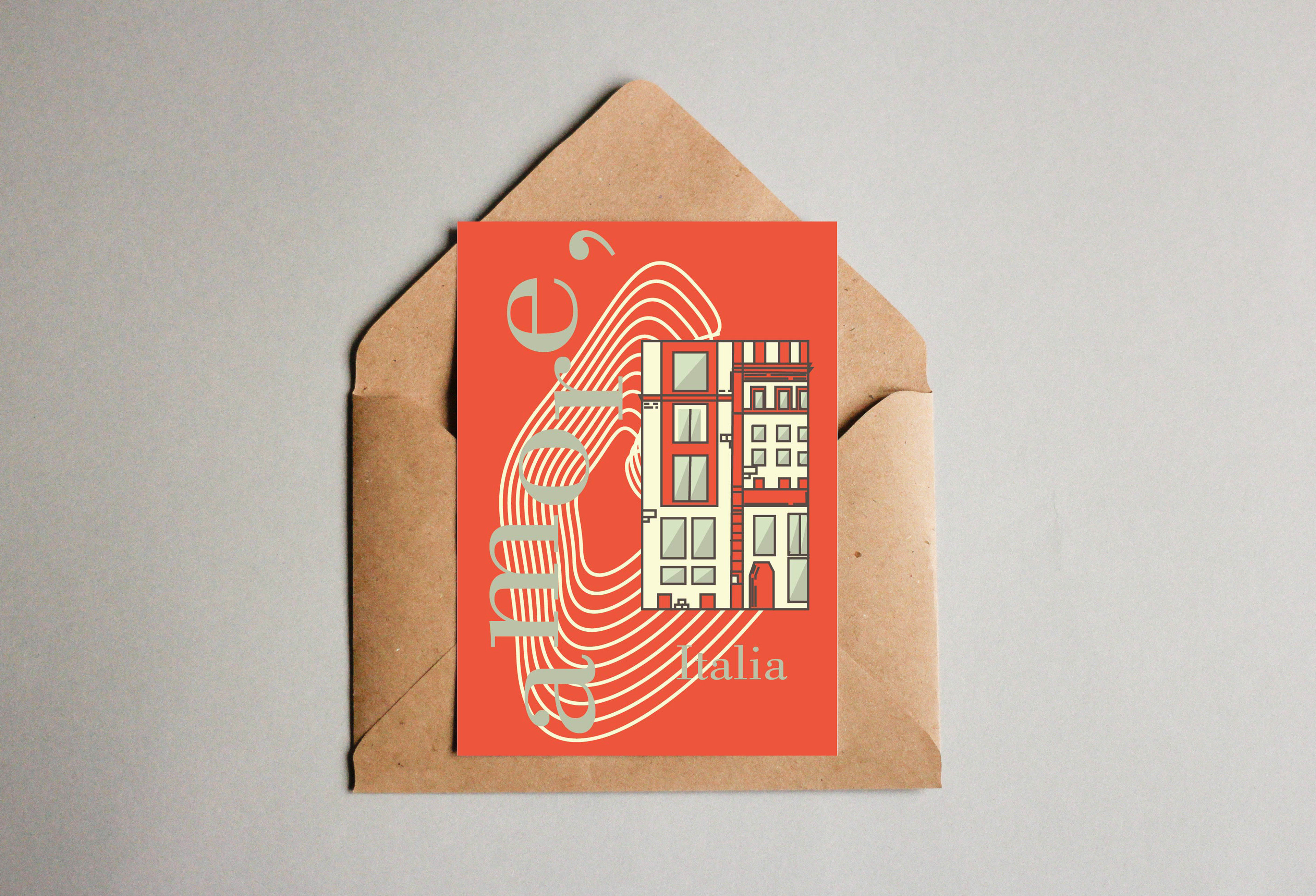
Inspired by the work of artist Meg Robichaud, I created a series of vector illustrations that drew from her distinctive style, known for its bold lines and expressive use of colour. I used my photographs as references to create dynamic and visually captivating illustrations that retained the essence of the original subjects while introducing my unique interpretation.
The project was part of a Type and Image assignment focused on Italy and Italian culture. I aimed to capture the vibrancy and energy of Italian life through the lens of my vector illustrations while incorporating elements that paid homage to the rich history and artistic heritage of the country.
To achieve this, I carefully analysed Meg Robichaud’s approach to illustration, which often blends graphic simplicity with intricate detail, allowing for bold visual statements. I used Adobe Illustrator to bring my drawings to life, leveraging the software's tools to create smooth, clean lines and vibrant, harmonious colour schemes that reflected both the modern aesthetic of Robichaud’s work and the cultural elements of Italy.
The final pieces were thoughtfully integrated into my Type and Image project, where they played a key role in conveying the mood and theme of Italian culture.
This project not only enhanced my technical skills in vector illustration but also helped me explore how illustration can work in conjunction with typography to communicate a clear, compelling message. The resulting artwork seamlessly blended both my style and the inspiration I drew from Meg Robichaud's work, creating a series of vibrant illustrations that enhanced the visual identity of my project.
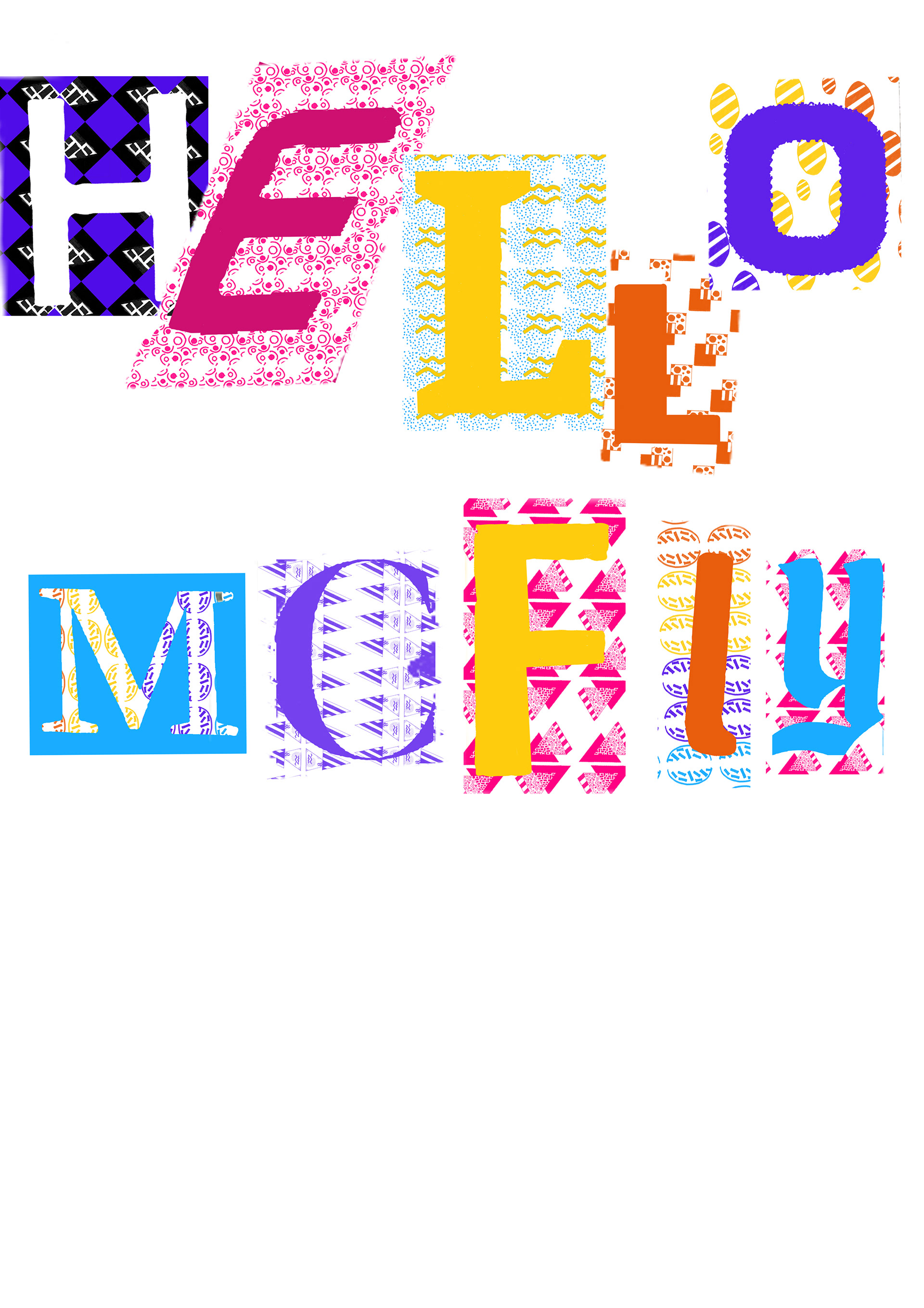
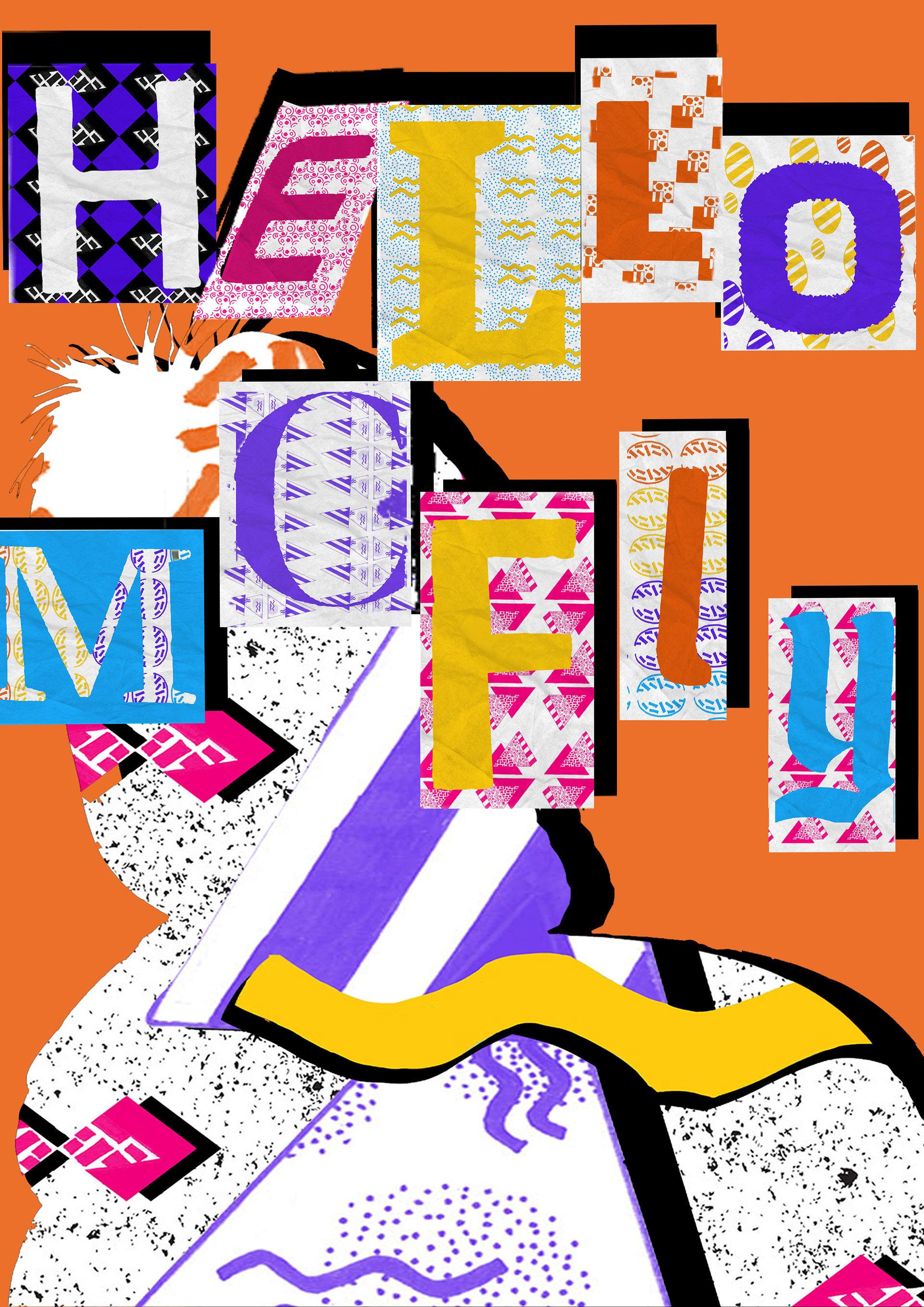
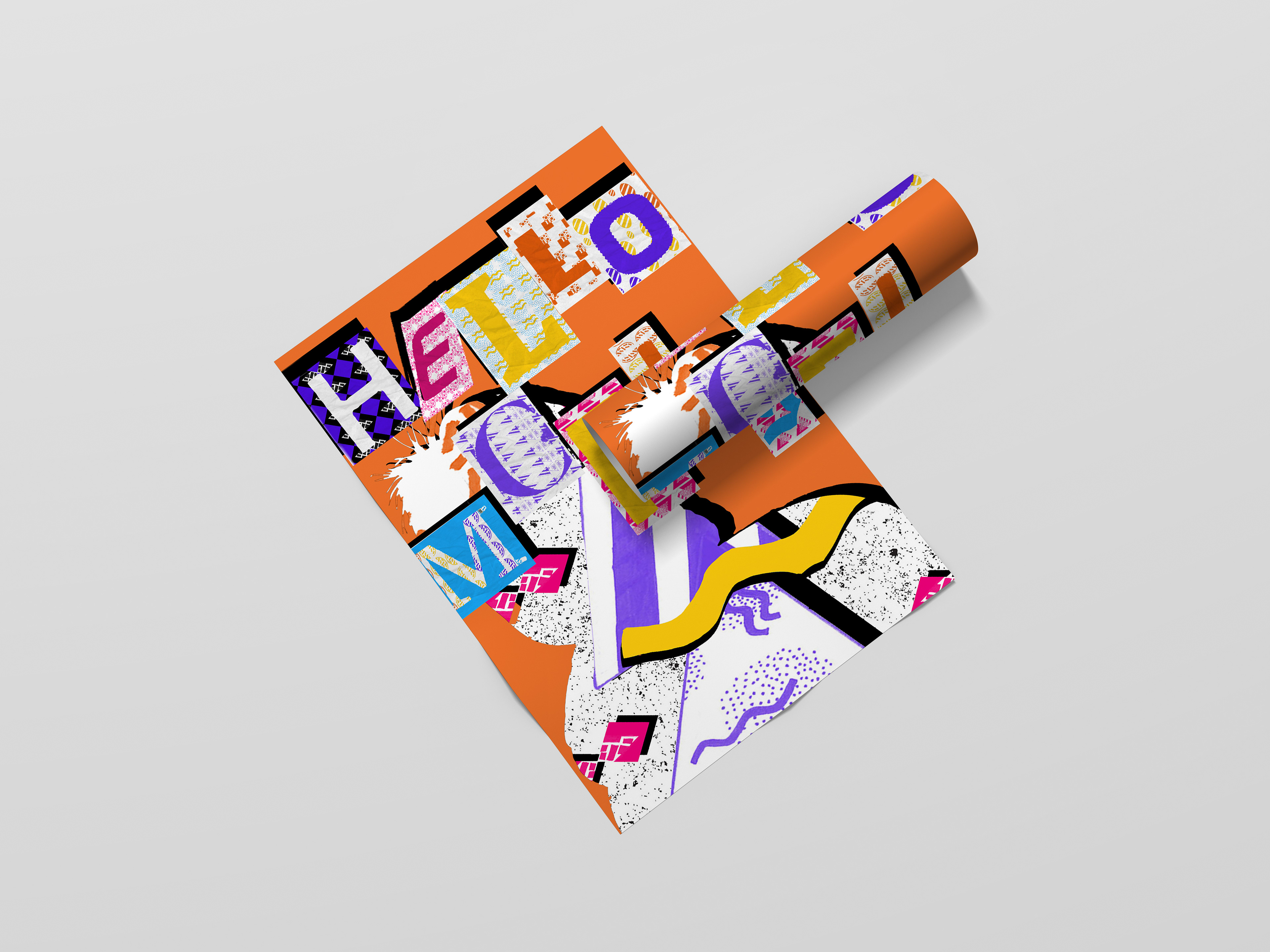
City of Angels Film Fest project
Inspired by the work of artist Greg Lamarche, I developed a unique typographic composition for my progression exam, which was centred around the City of Angels Film Fest, an 80s-themed film festival. Drawing from Lamarche’s dynamic approach to layering digital typography with hand-drawn elements, I sought to combine the bold, geometric style of digital type with the organic, expressive qualities of hand-crafted patterns.
The creative process began by designing a custom digital type, which formed the foundation of the composition. To infuse a sense of individuality and character, I incorporated hand-drawn patterns that reflected the distinctive graphic aesthetic of 1980s design—incorporating angular shapes, textured lines, and vibrant colours. This combination of digital precision and hand-rendered elements allowed for a juxtaposition of the mechanical and the organic, capturing the spirit of the era while giving the design a contemporary edge.
Due to the constraints of lockdown, I worked remotely and adapted my process, using digital tools and scanning hand-drawn patterns to merge both techniques seamlessly. Despite the limitations, the project became an opportunity to experiment with various forms of visual expression, ultimately resulting in a striking typographic piece that encapsulated the energy of 80s cinema and the festival's theme.
The final design served as both a tribute to the visual culture of the 1980s and an exploration of the interplay between digital and analogue design methods, bringing together past and present techniques in a cohesive and original piece.
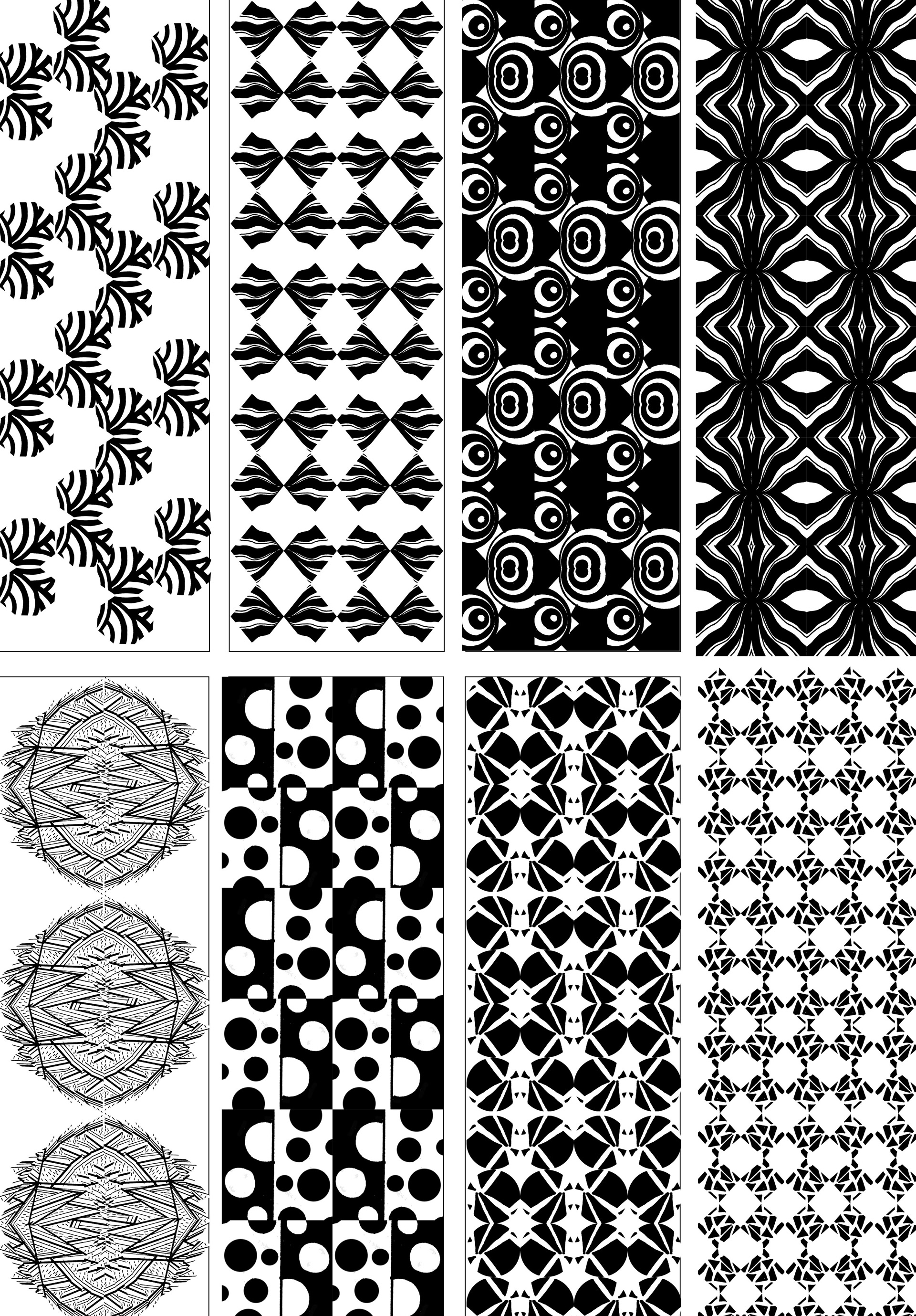
Patterns I created and used for the type
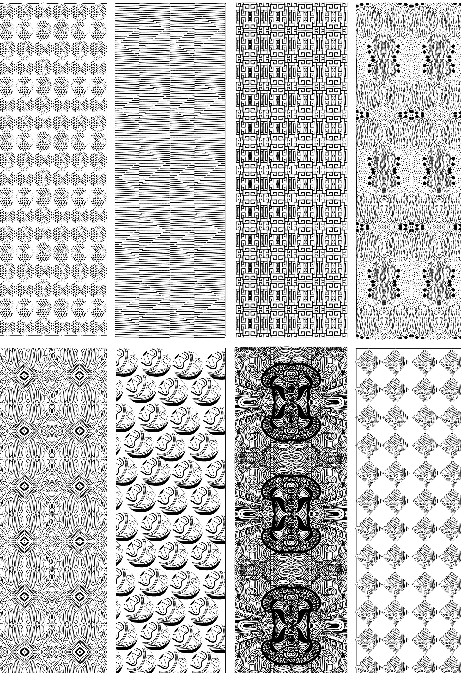
Patterns I created and used for the type
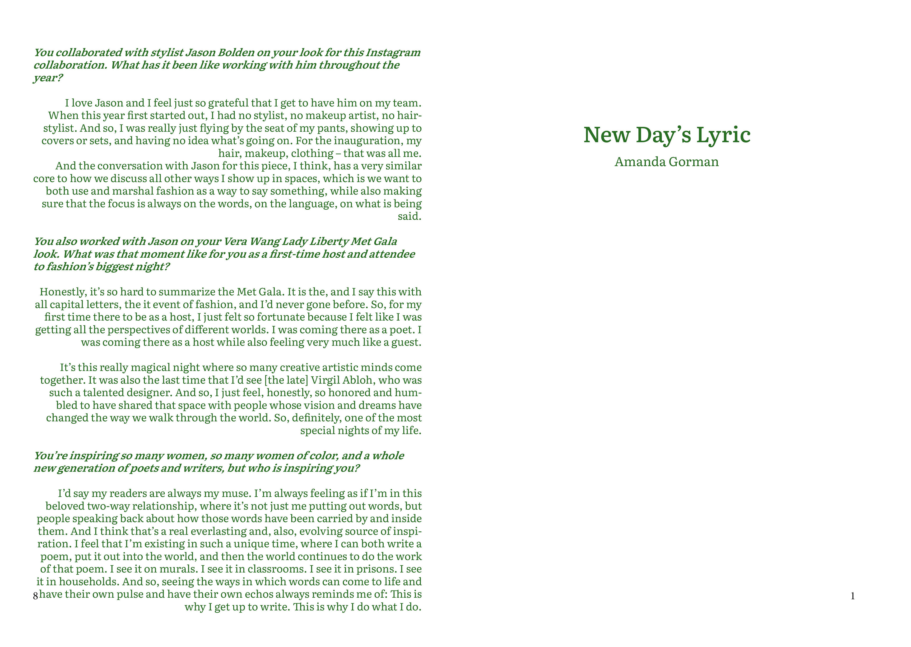
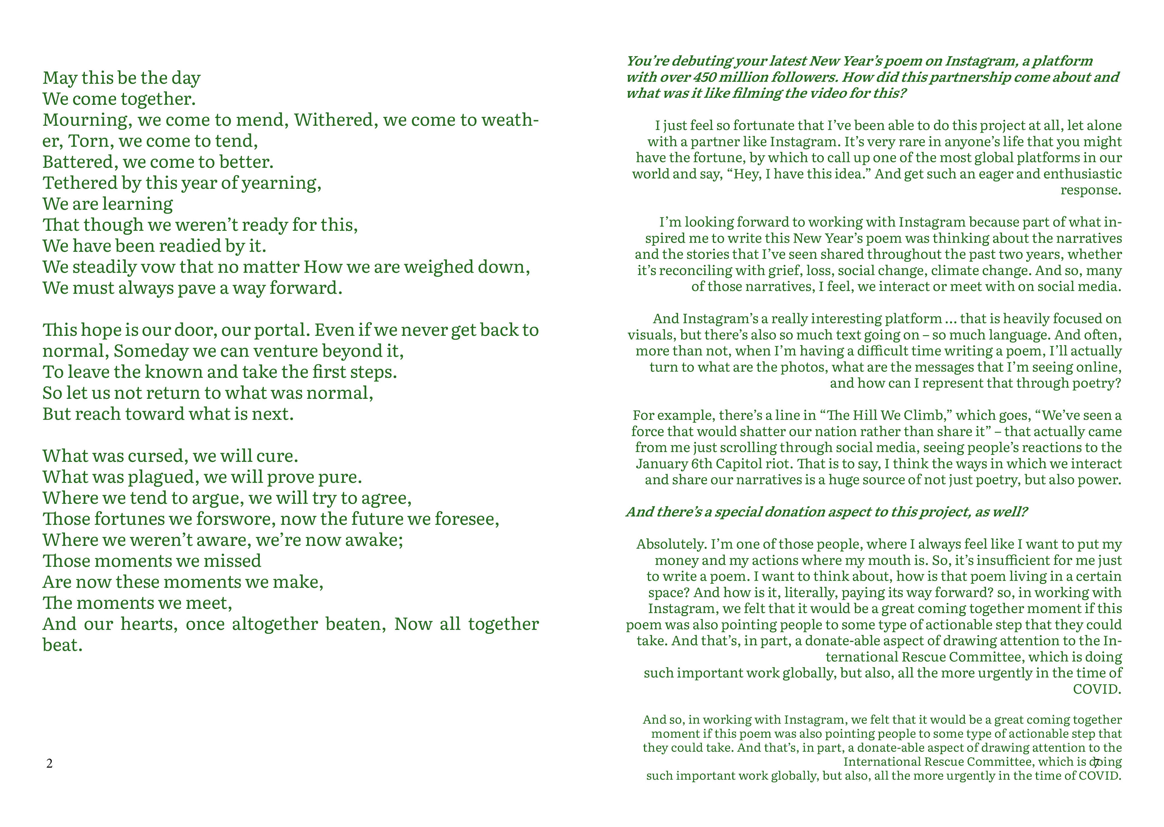
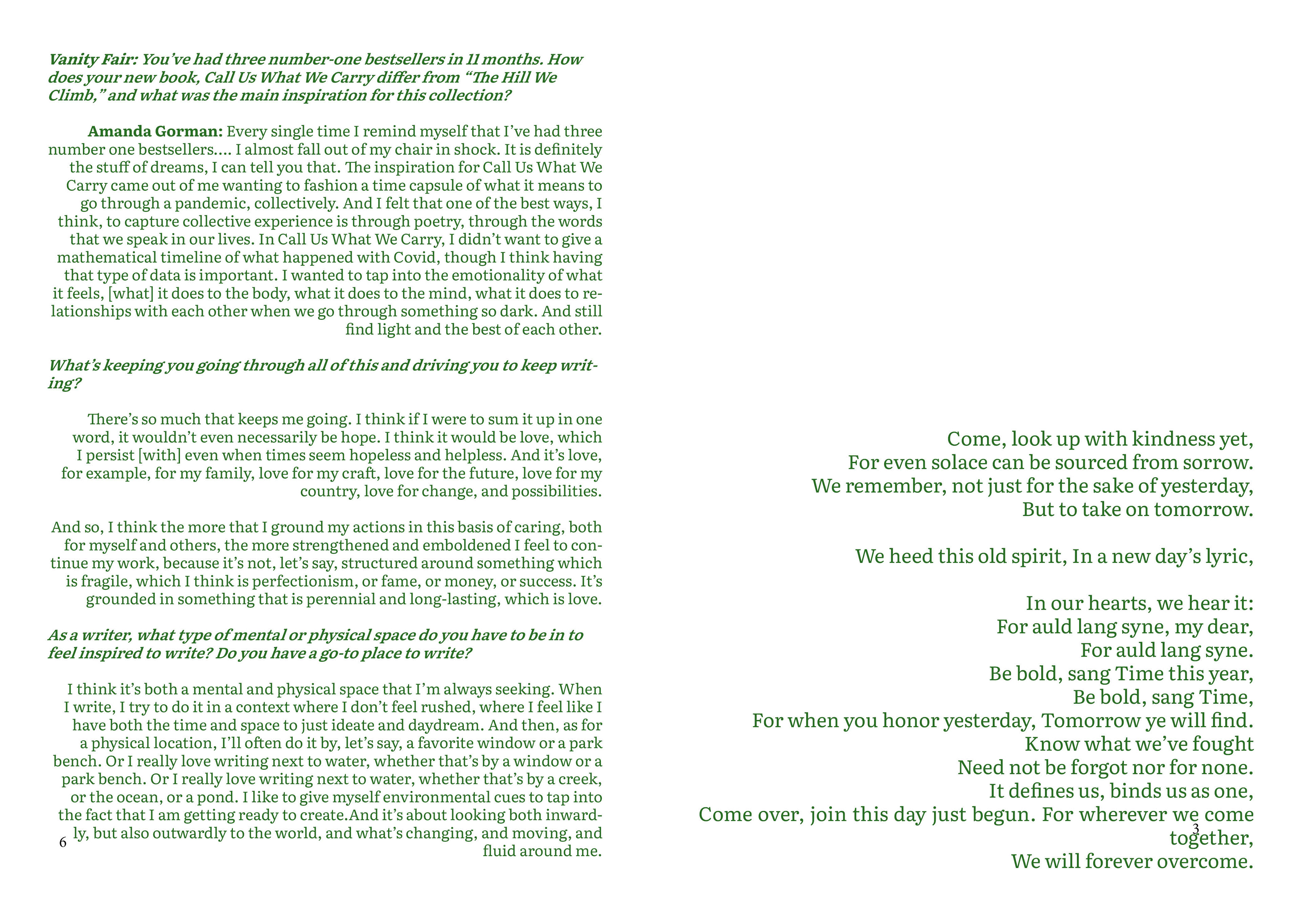
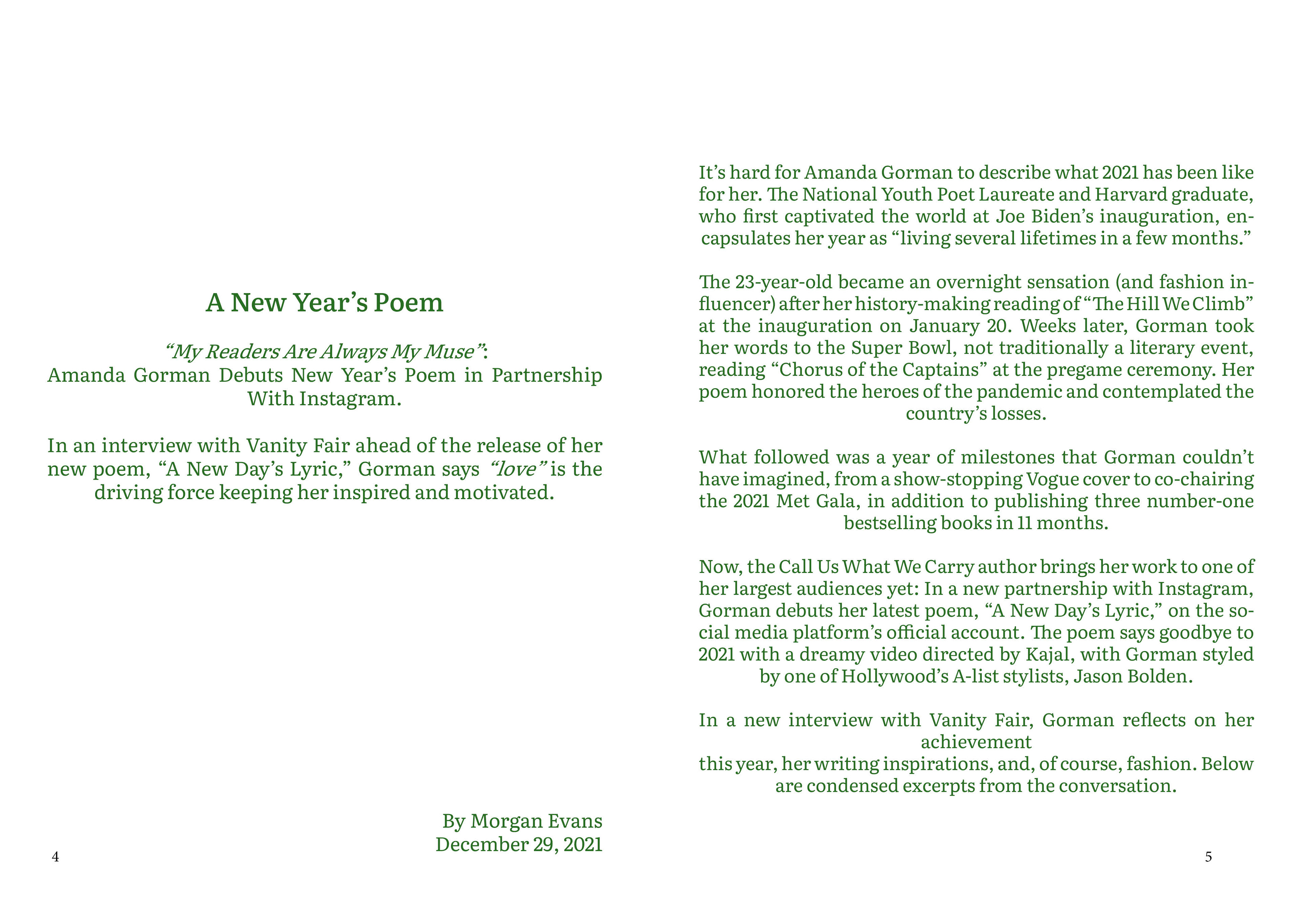
New Day's Lyric typography project
During my second semester at university, I engaged in a project focused on typographic composition, where the primary objective was to explore the relationship between text, layout and visual hierarchy. As part of the brief, we were provided with a poem and tasked with creating a booklet that would house both the poem and an accompanying interview, emphasizing the integration of typography as a key design element.
The project required strict adherence to a monochromatic colour scheme, meaning I could only use one colour throughout the entire design. This constraint challenged me to think creatively about how to use tone, texture, and contrast within the typographic composition. I carefully selected a typeface that complemented the mood and themes of the poem, ensuring that the font choices not only aligned with the content but also conveyed the emotional depth of the writing.
The composition of the text was equally critical; I meticulously considered the layout and spacing to enhance readability and ensure that the flow between the poem and interview was seamless. Every design decision—from the sizing and positioning of the type to the placement of the elements on each page—was made to create a harmonious balance between the two forms of text while maintaining visual interest.
This project was an exploration of how typography can shape the reading experience, demonstrating the power of careful design to amplify the meaning and emotional impact of written content.