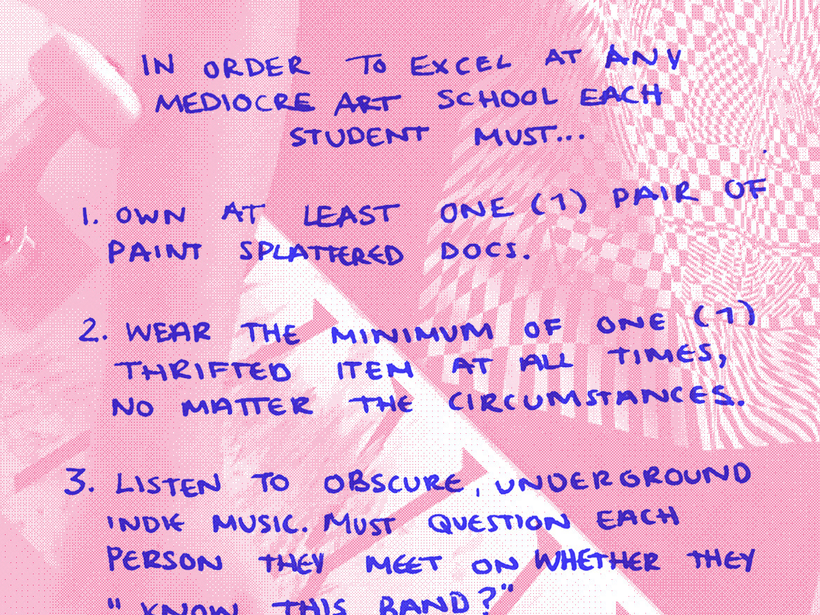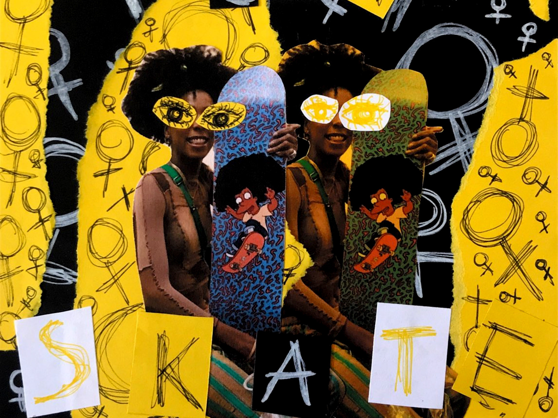
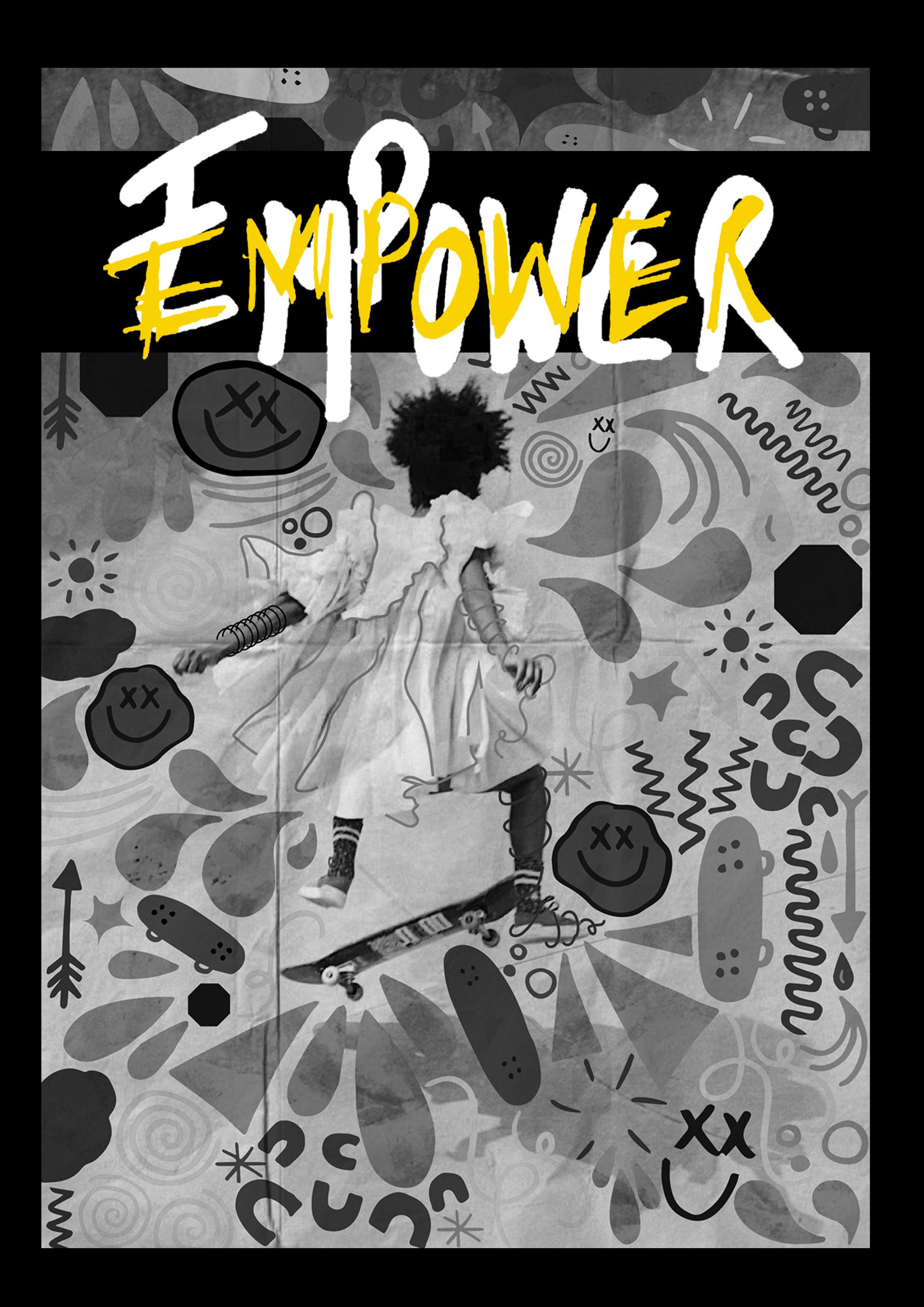
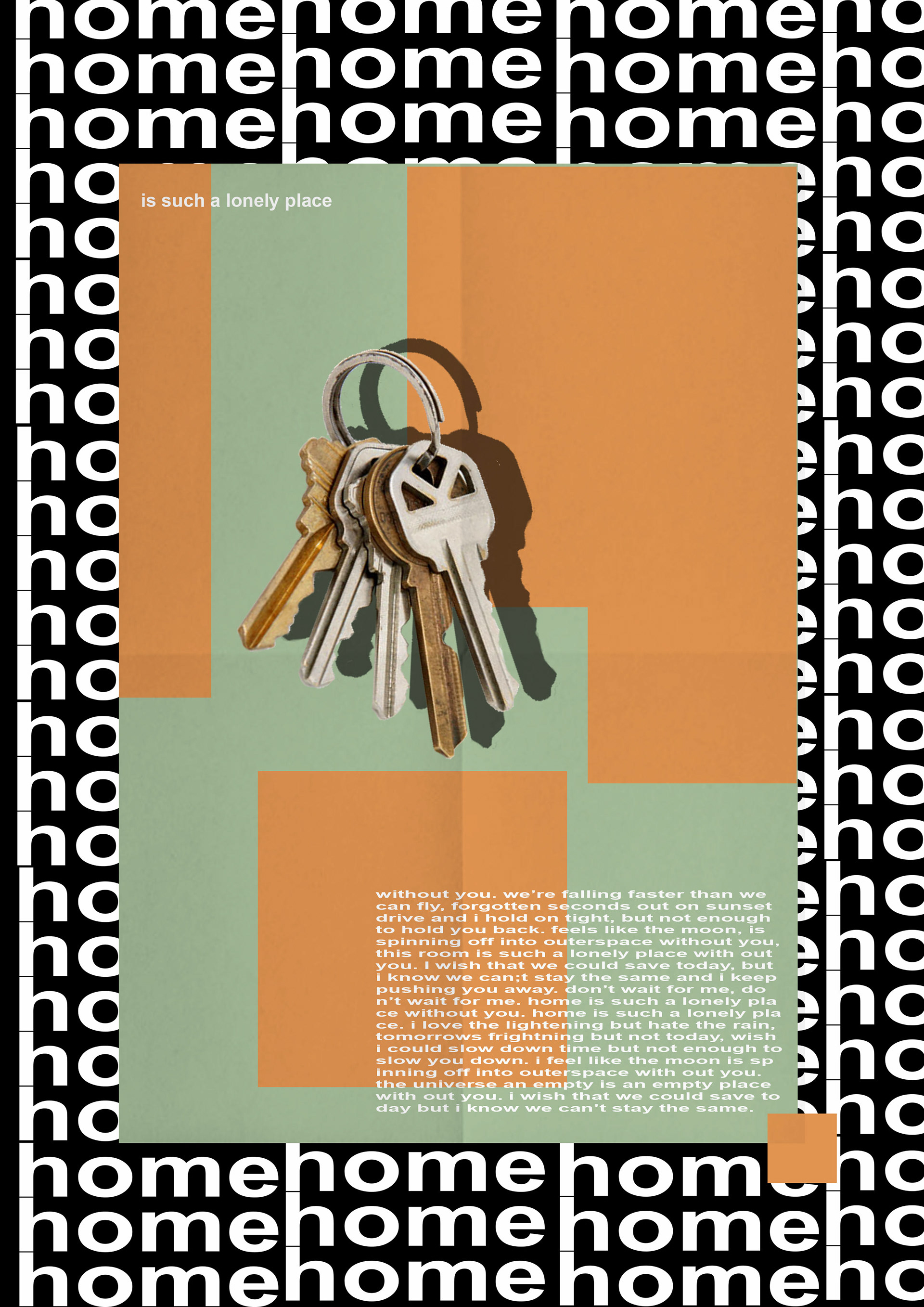
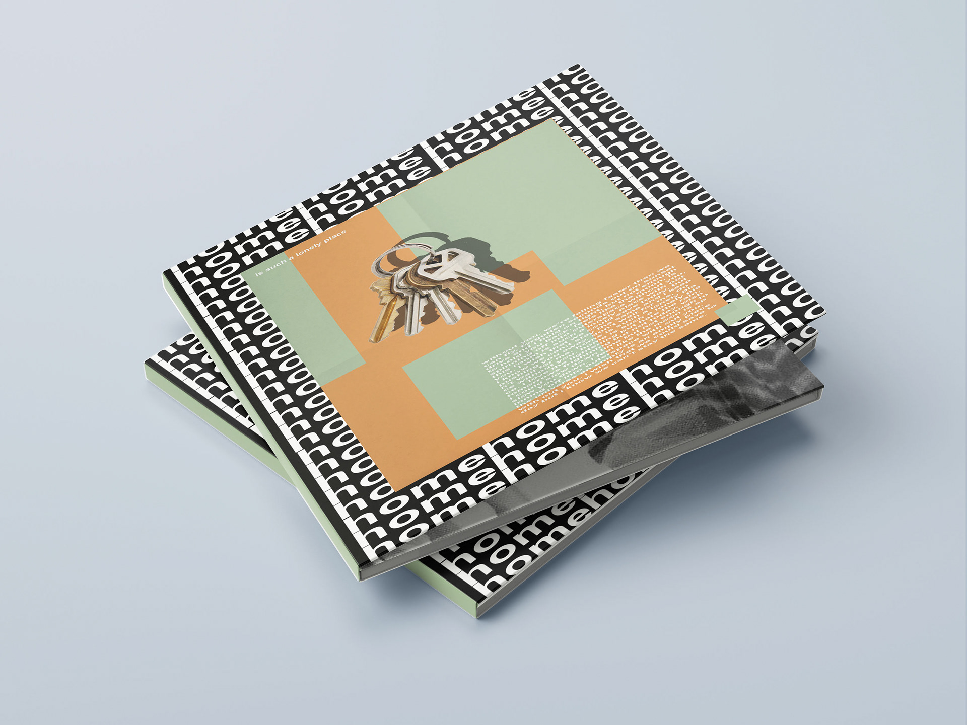
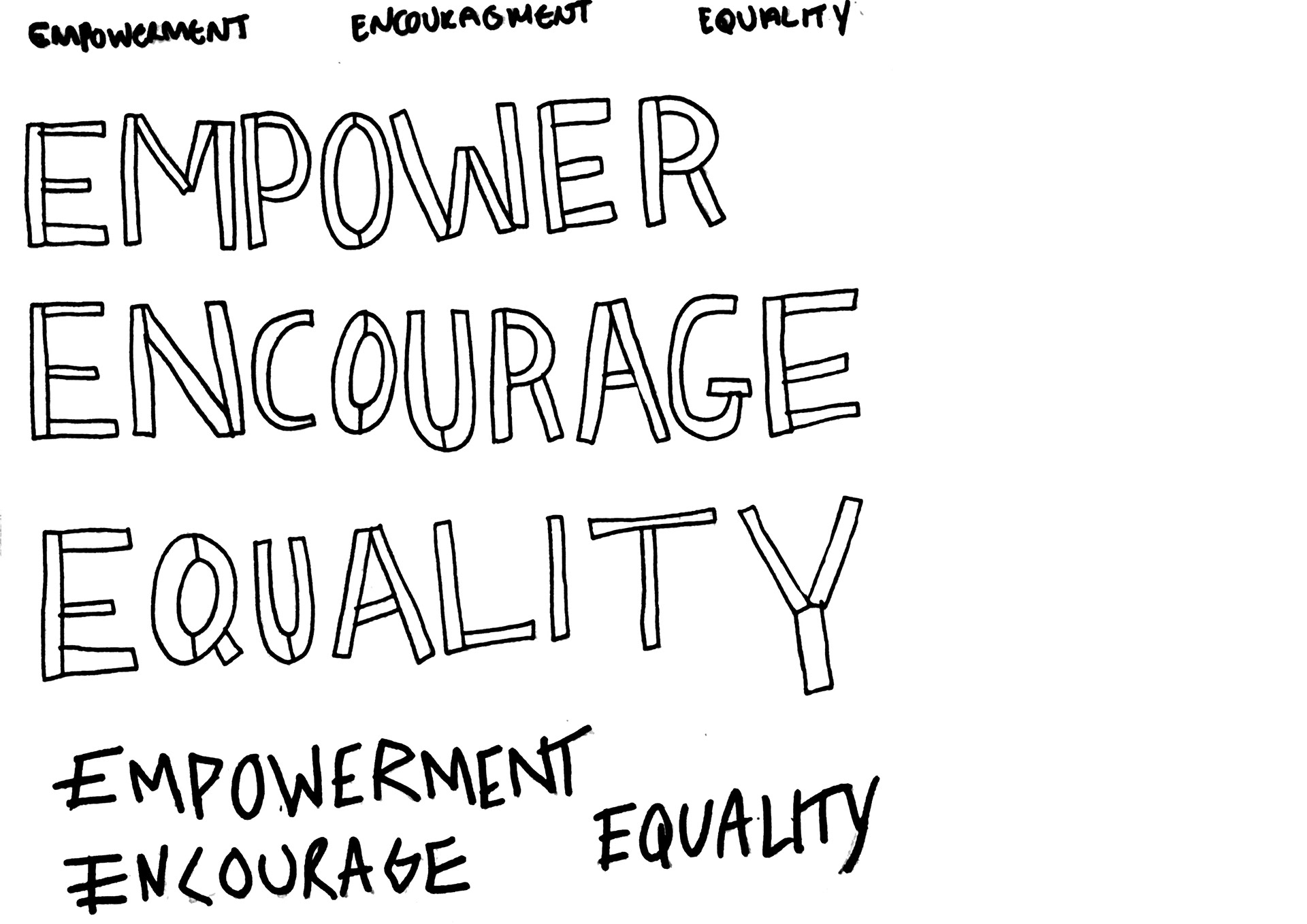
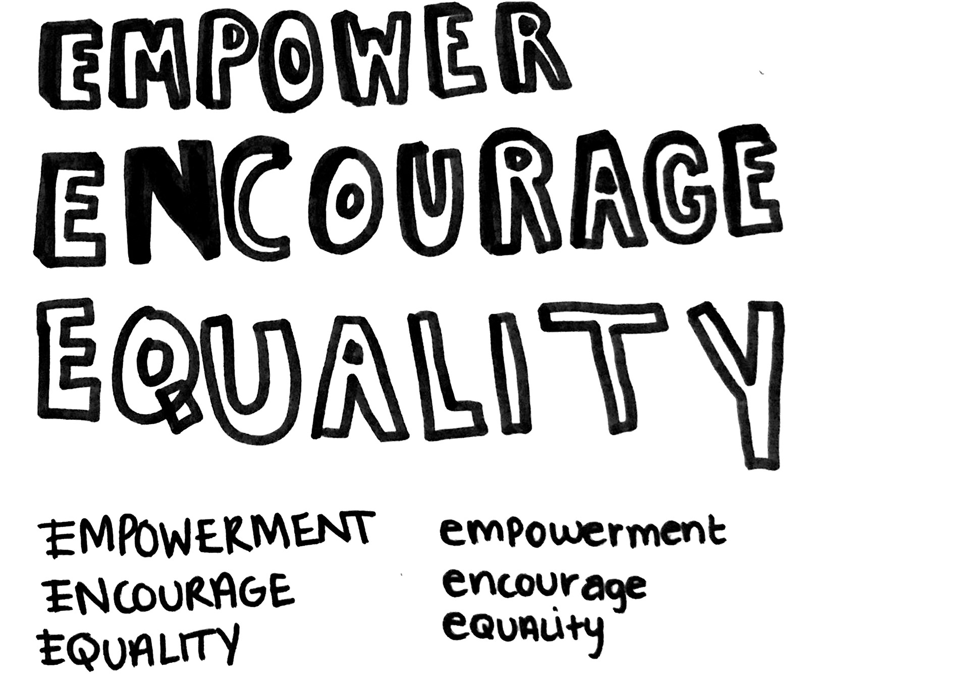
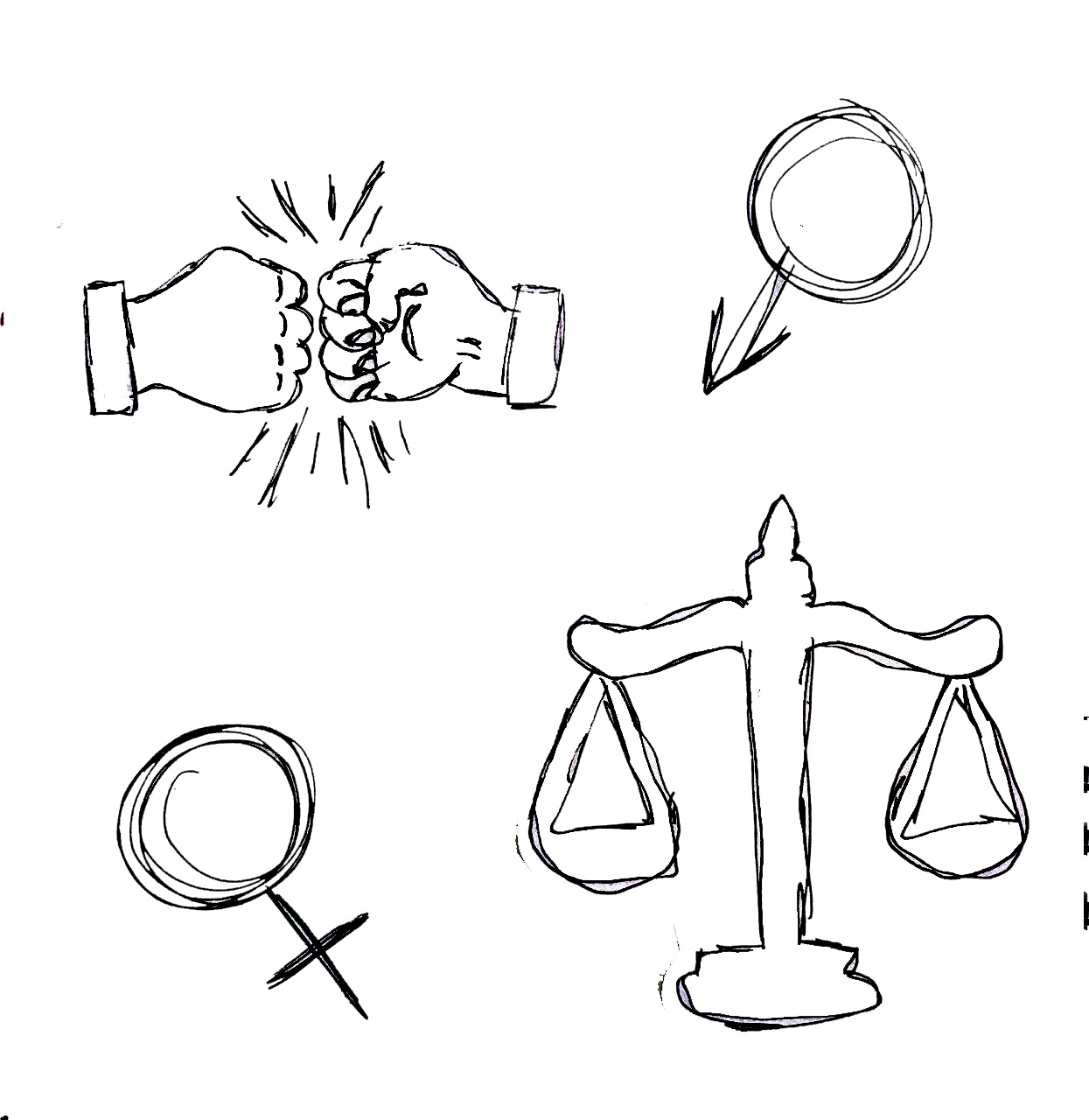
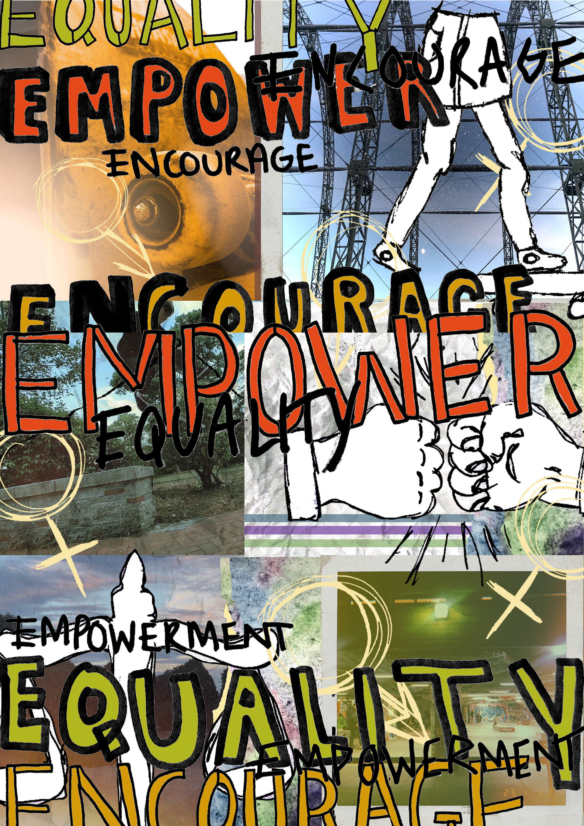
Girls Can't Skate Skate Jam project
For my Girls Can't Skate Skate Jam project, I created a series of type and image compositions to promote the event, drawing on a blend of hand-rendered typography, original photography and digital collage techniques. The project aimed to capture the energy, empowerment, and inclusivity of the female skateboarding community while challenging traditional representations of the sport.
I began by hand-rendering custom types, and carefully crafting letterforms that reflected the bold, dynamic spirit of skateboarding culture. The hand-drawn type was then integrated with my photography, which captured real moments from skate sessions, conveying authenticity and the raw energy of the event. To further enhance the visual impact, I used Photoshop and Illustrator to create digital collages, layering the type and imagery in a way that brought the visual elements together into cohesive, striking compositions.
I designed three distinct posters for the event, each with its own visual identity yet united by a consistent aesthetic. By experimenting with colour, composition, and texture, I was able to create posters that were not only eye-catching but also communicated the essence of the Girls Can't Skate event—celebrating the strength and presence of women in the skateboarding world.
The outcomes were a reflection of my technical skills in both Photoshop and Illustrator, while also showcasing my ability to merge traditional and digital techniques in a way that communicated both the spirit of the event and the vibrancy of the skateboarding community.
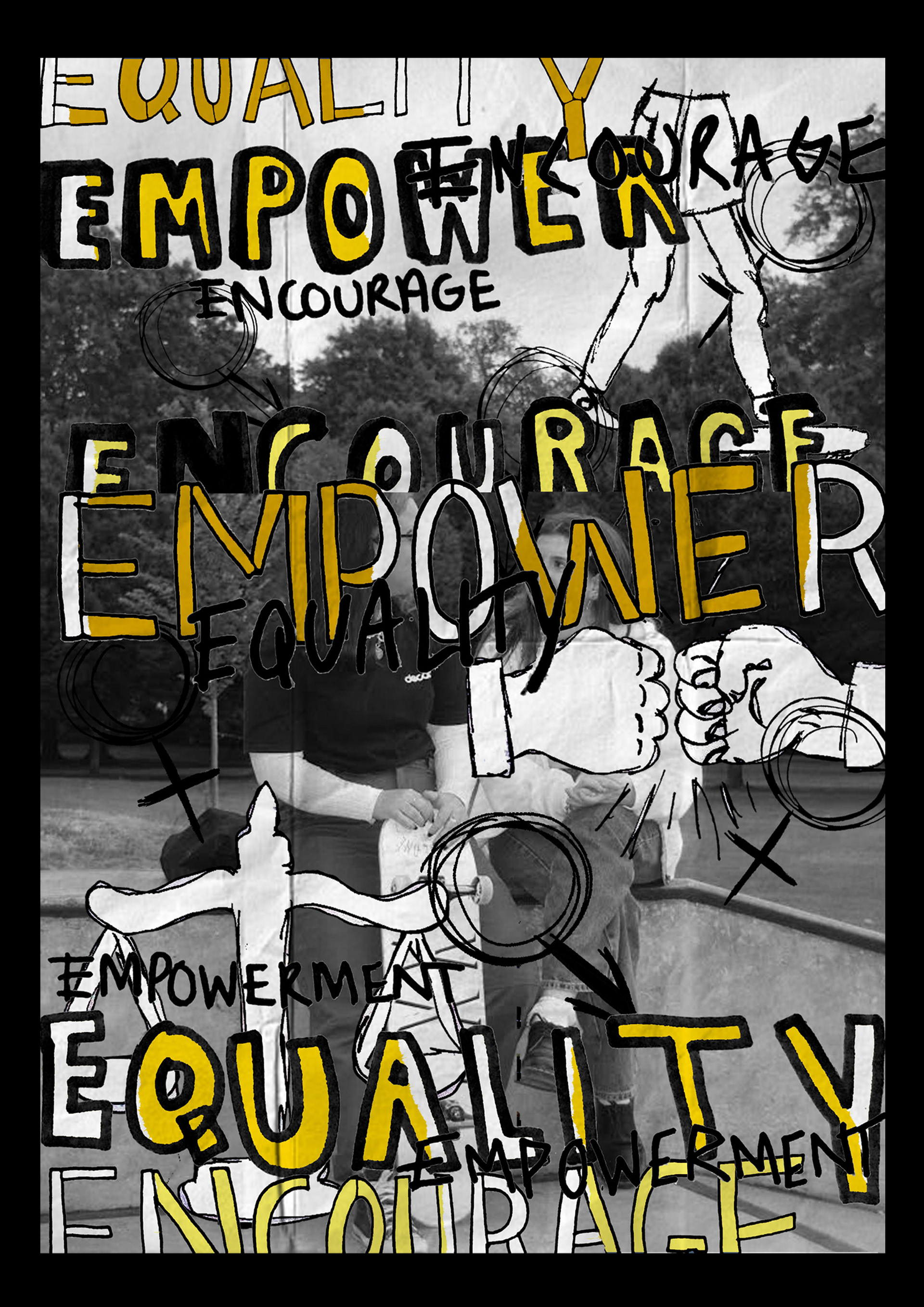
Poster design
Inspired by the distinctive visual style of artist Lucas Grassmay, I created a series of type and image compositions for an independent study I undertook during lockdown. The project focused on the genre of punk music, specifically drawing influence from the iconic band Blink-182, whose raw energy and rebellious spirit informed the direction of my work.
For this project, I used a pre-existing typeface as the foundation of my designs, which I then deconstructed and manipulated to reflect the chaotic, yet expressive essence of punk culture. The process involved combining bold typography with graphic imagery, creating compositions that were both visually dynamic and thematically aligned with the punk ethos of defiance and individualism.
I experimented with different techniques to push the boundaries of the typeface, altering its structure, adding distressed textures, and incorporating elements that conveyed the fast-paced, often irreverent nature of the music. The imagery that accompanied the type was equally pivotal, utilizing elements such as hand-drawn illustrations and collages to evoke the raw, DIY aesthetic associated with punk rock.
The outcomes not only reflected my deep connection to the genre but also served as an exploration of how typography can be used as a powerful visual tool to communicate the energy, attitude, and cultural significance of music. This independent study allowed me to hone my skills in blending type with image, while also deepening my understanding of how design can reflect and amplify the message of a particular cultural movement.
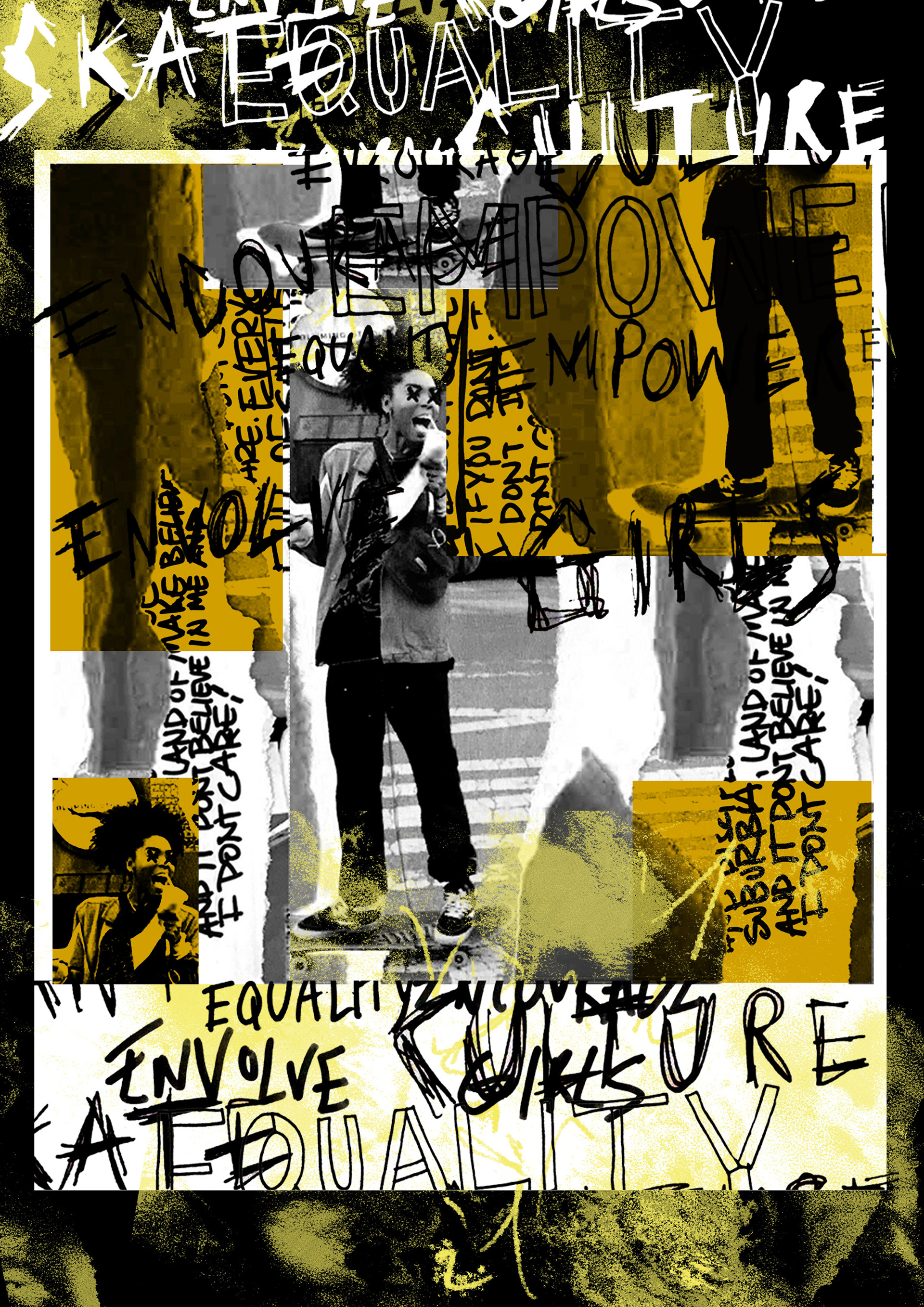
Girls Can't Skate Skate Jam project
Inspired by the groundbreaking work of David Carson, I created a photomontage as part of my research for my second-year project, which explored contemporary artists influenced by the Dada art movement. Carson's experimental approach to typography and design, characterised by his deconstructed layouts and unconventional use of imagery, served as a key reference point for my exploration of visual communication and its ability to challenge traditional norms.
For this project, I combined a mix of hand-written type, hand-drawn illustrations and my photographs to create a dynamic and layered composition. The handwritten type was purposefully distorted and fragmented, reflecting the chaotic and irreverent spirit of Dadaism, while the illustrations added a layer of spontaneity and personal expression to the design. I integrated my photographic work to ground the piece in the present, bringing a sense of realism to the otherwise abstract, experimental nature of the composition.
The photomontage allowed me to push the boundaries of visual communication, blending text and imagery in unexpected ways to provoke thought and challenge conventional design principles. This process not only honed my technical skills in combining traditional and digital media but also deepened my understanding of how design can be used as a tool for artistic expression and cultural critique. The project ultimately became a reflection of the Dada movement's influence on modern design, illustrating how contemporary artists continue to reimagine and deconstruct established forms of visual language.
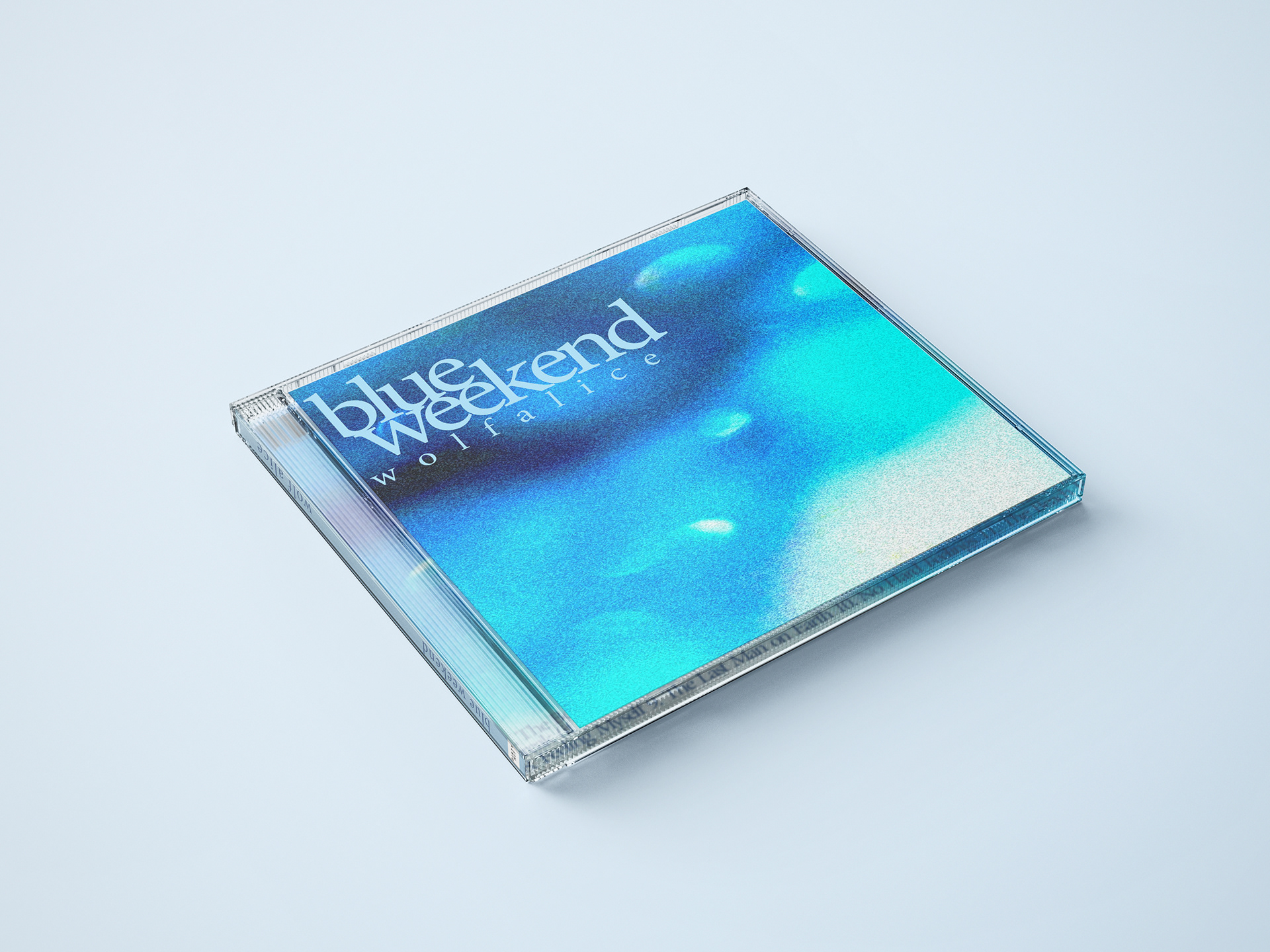
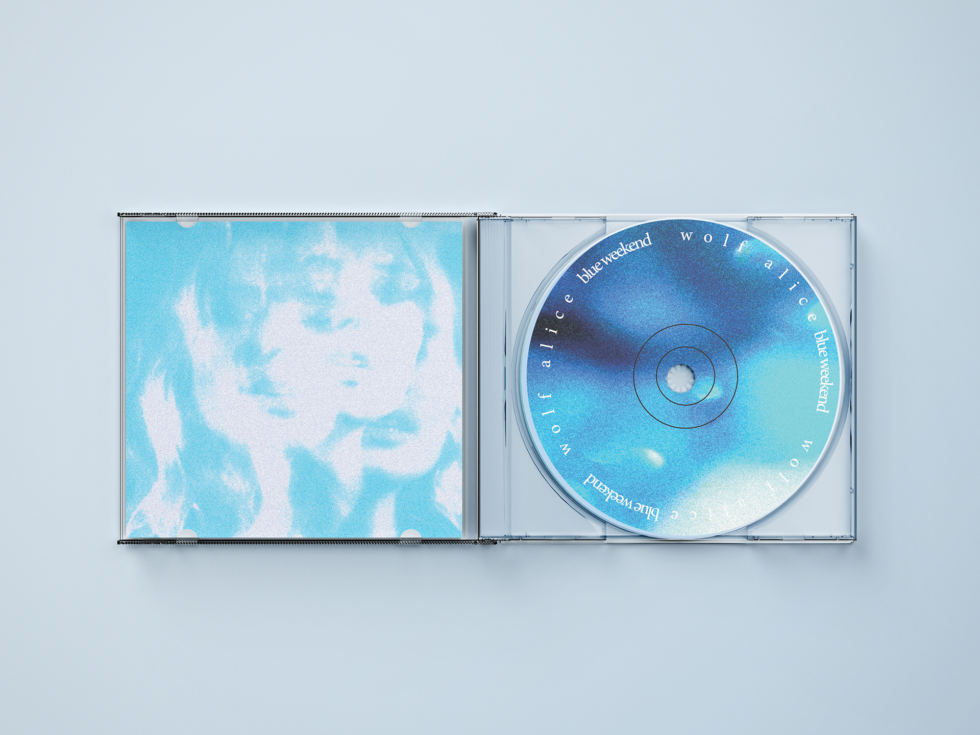
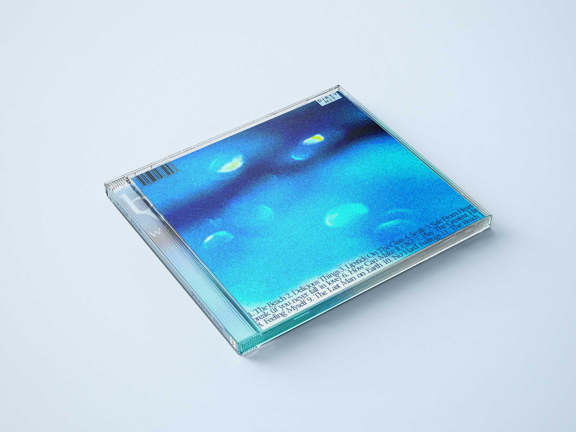
Let There Be Light project - part two
Towards the end of my first semester, I had the opportunity to combine two previous projects into one cohesive design. For this task, I took photographs I had captured during a prior project titled Let There Be Light and integrated them with typographic elements to reimagine the album cover for Blue Weekend by Wolf Alice.
The original Let There Be Light project focused on capturing the interplay of light and shadow, exploring how natural and artificial light could shape mood and atmosphere. I selected a series of these photographs that I felt resonated with the emotional tone and themes of Blue Weekend, the album’s introspective and atmospheric qualities. By juxtaposing my photographs with carefully chosen typography, I sought to create a visual representation that mirrored the album’s blend of raw emotion and musical texture.
I approached the design with a focus on creating a balanced and engaging composition, paying close attention to the relationship between the image and type. The typography was chosen to complement the mood of the photographs—using a combination of bold and delicate typefaces to reflect the contrast between light and dark and the intensity and subtlety in both the music and visuals.
This project not only allowed me to experiment with album cover design but also allowed me to refine my skills in blending photographic imagery with typography, creating a design that was both visually compelling and conceptually aligned with the themes of the album.
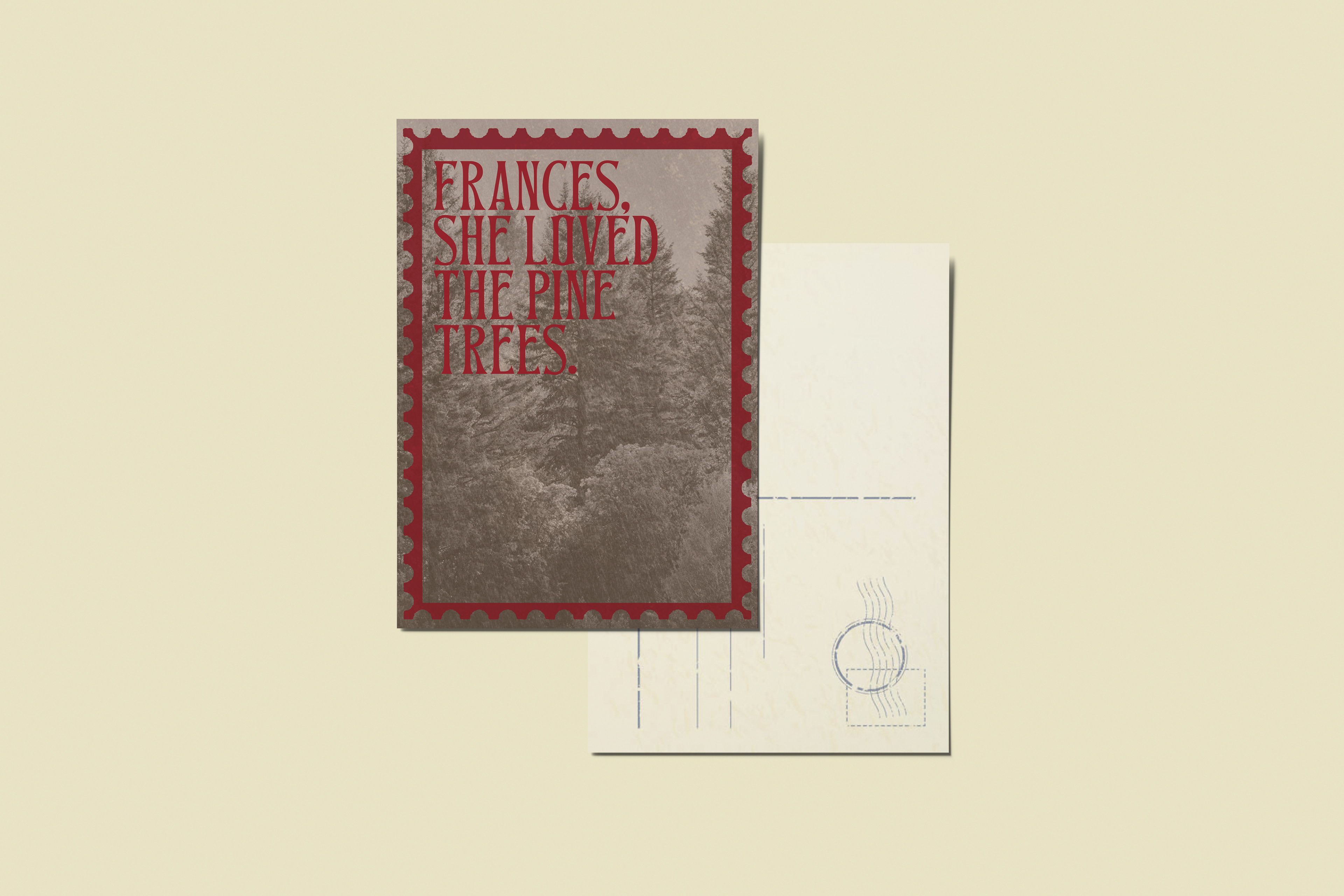
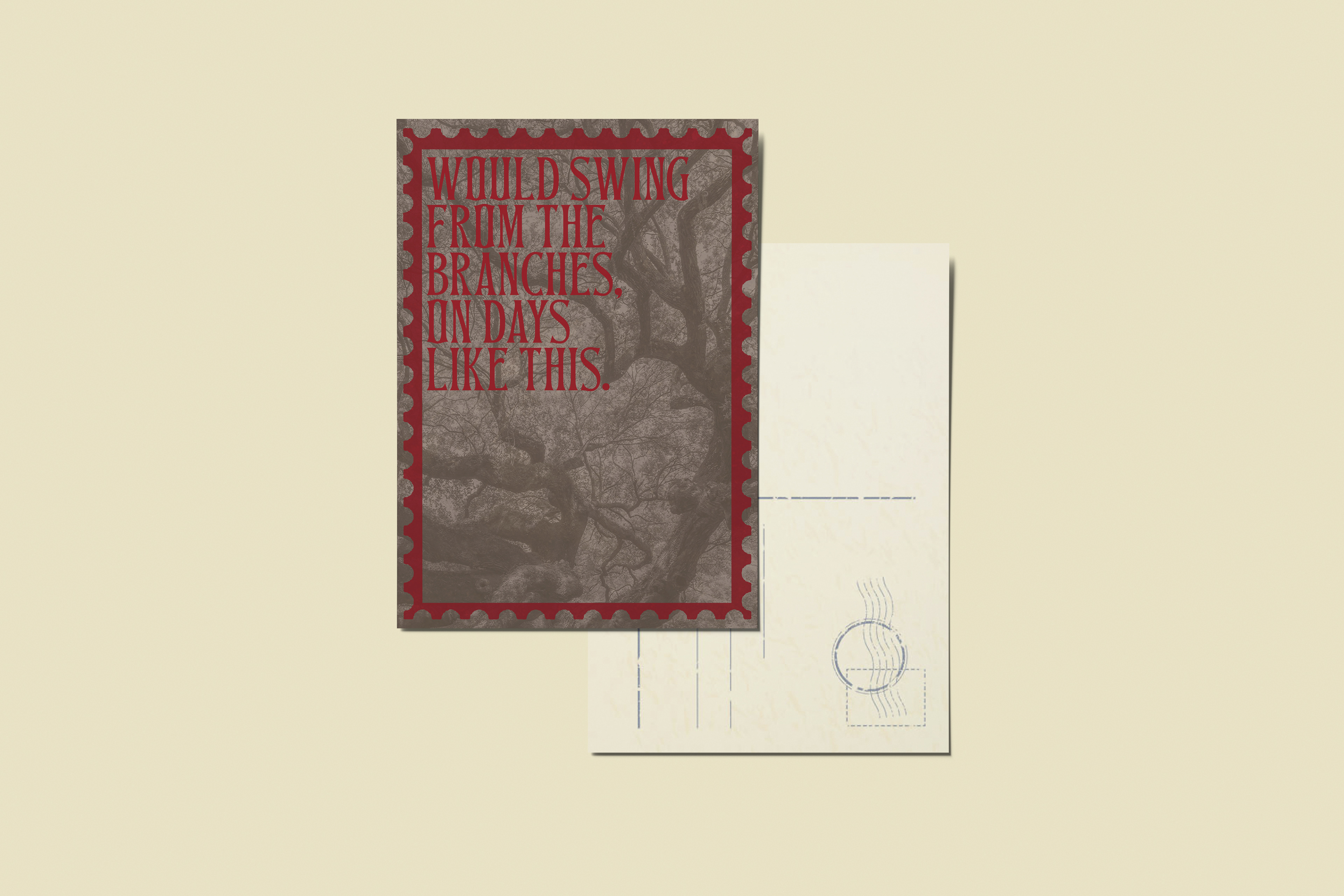
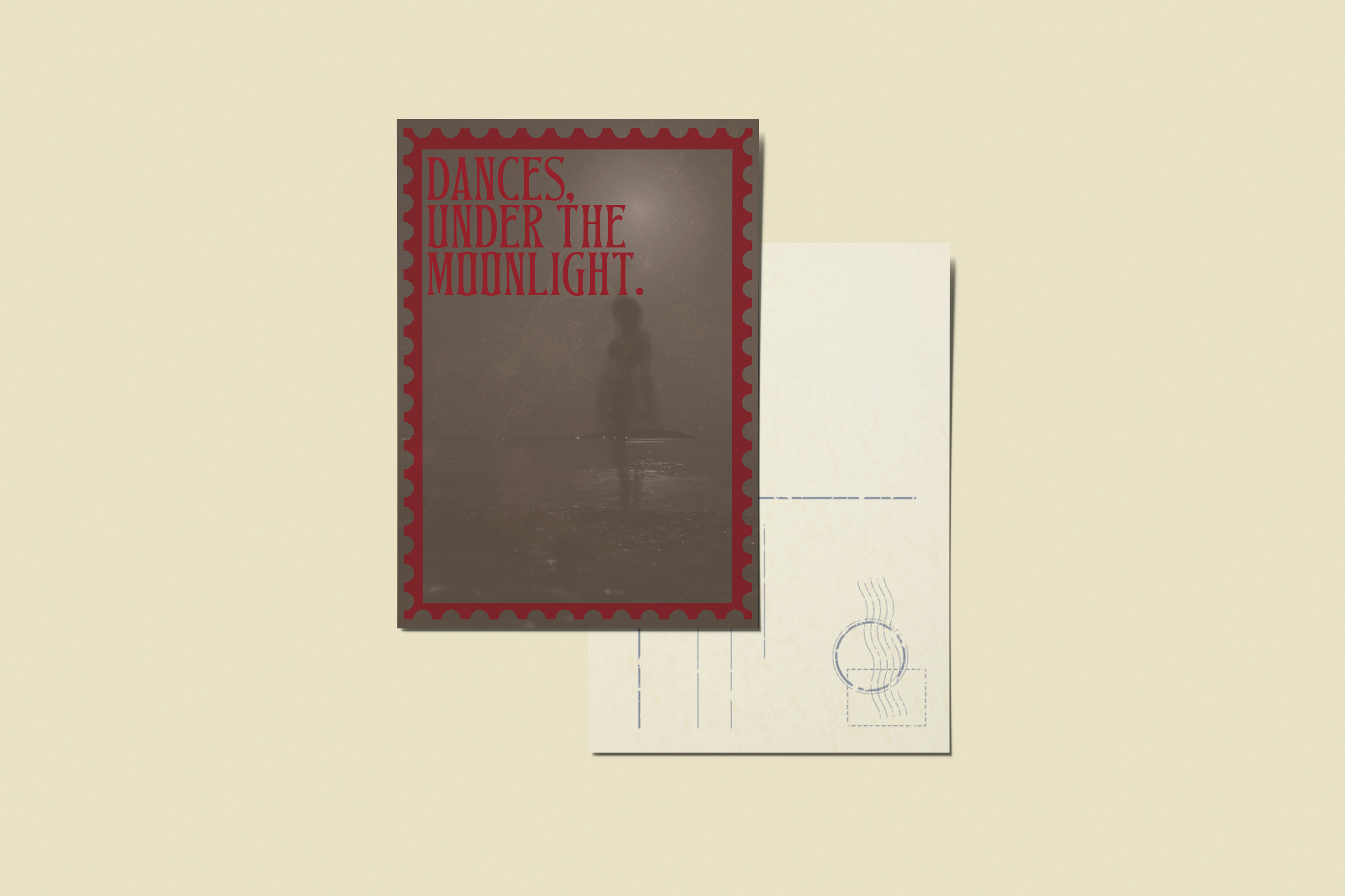
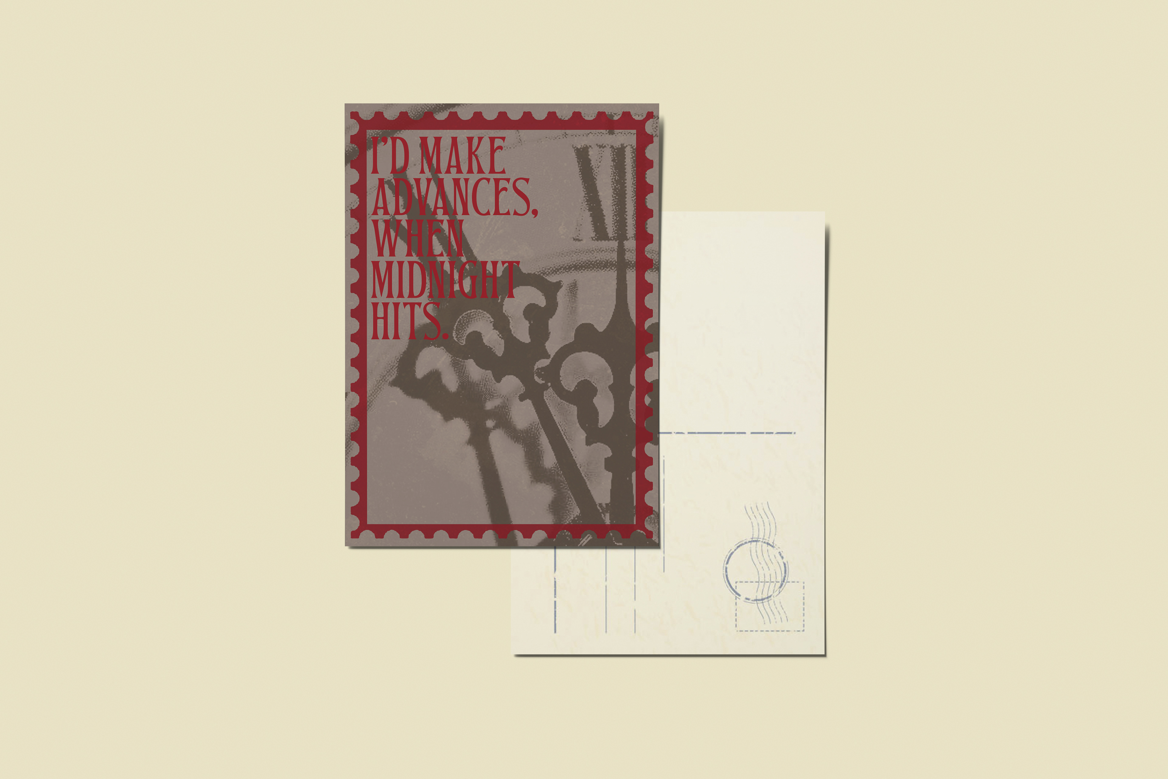
Rolemodel 'Frances' inspired postcards
I’m beyond excited to share these prints I’ve created, inspired by one of my all-time favourite songs from Rolemodel's latest album! Since its release, I’ve been completely captivated by the music and it’s been on constant repeat. One track that particularly resonated with me was Frances, so I decided to channel that inspiration into a series of prints.
The design concept reflects the emotional depth and atmospheric elements of the song, blending natural imagery with a sense of ethereal beauty. Incorporating motifs like trees, the moon and soft, organic textures, I aimed to capture the mood and essence of the track, which has a wistful yet captivating vibe. Each element was thoughtfully chosen to complement the tone of Frances, bringing the song’s energy into a visual form that I’m incredibly proud of.
Creating these prints was a truly rewarding experience, as I was able to immerse myself in the music that inspired me while also exploring new ways to represent that inspiration through design. I’m thrilled with how these turned out and can’t wait to share them with others who feel the same connection to the song and album as I do.