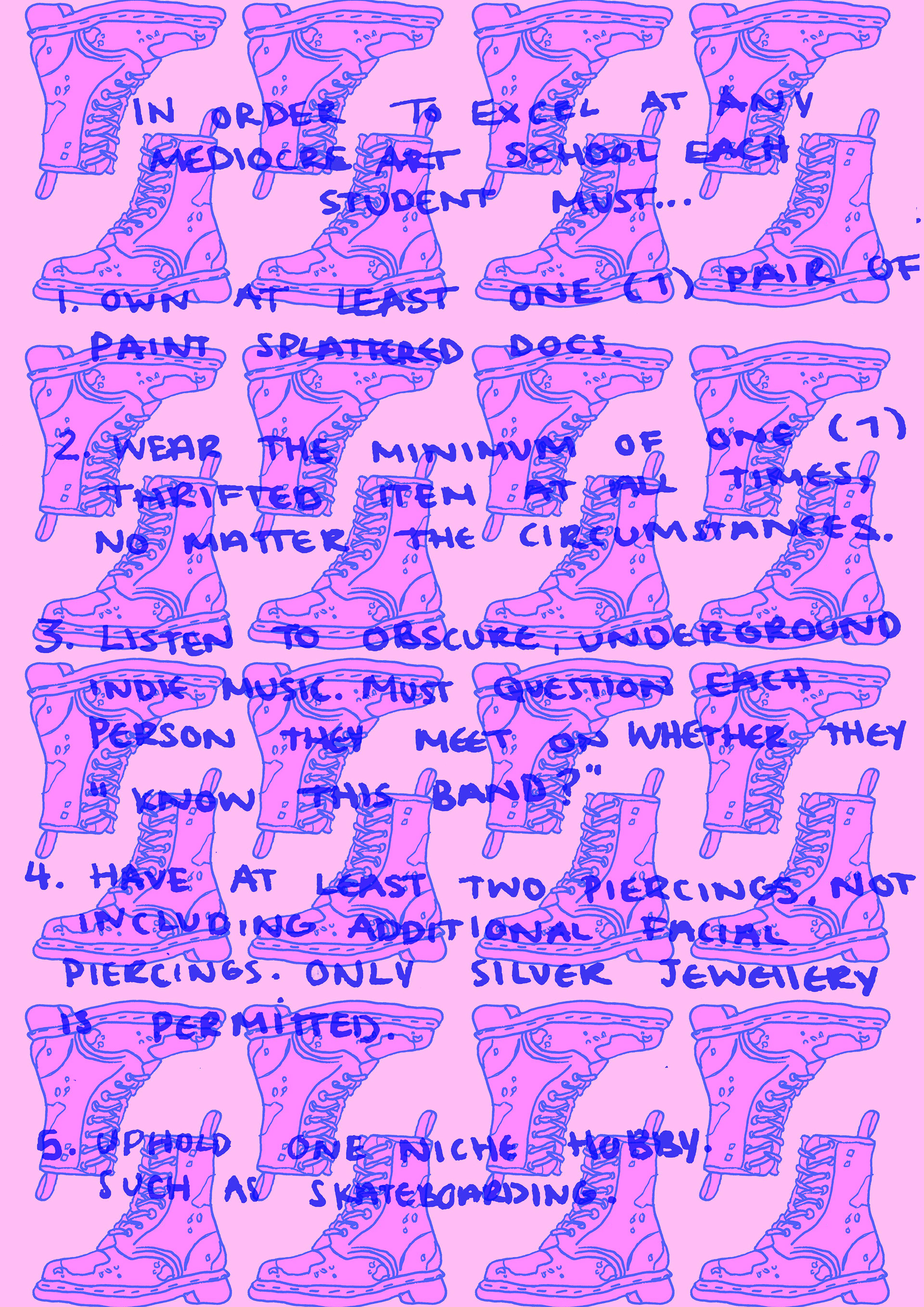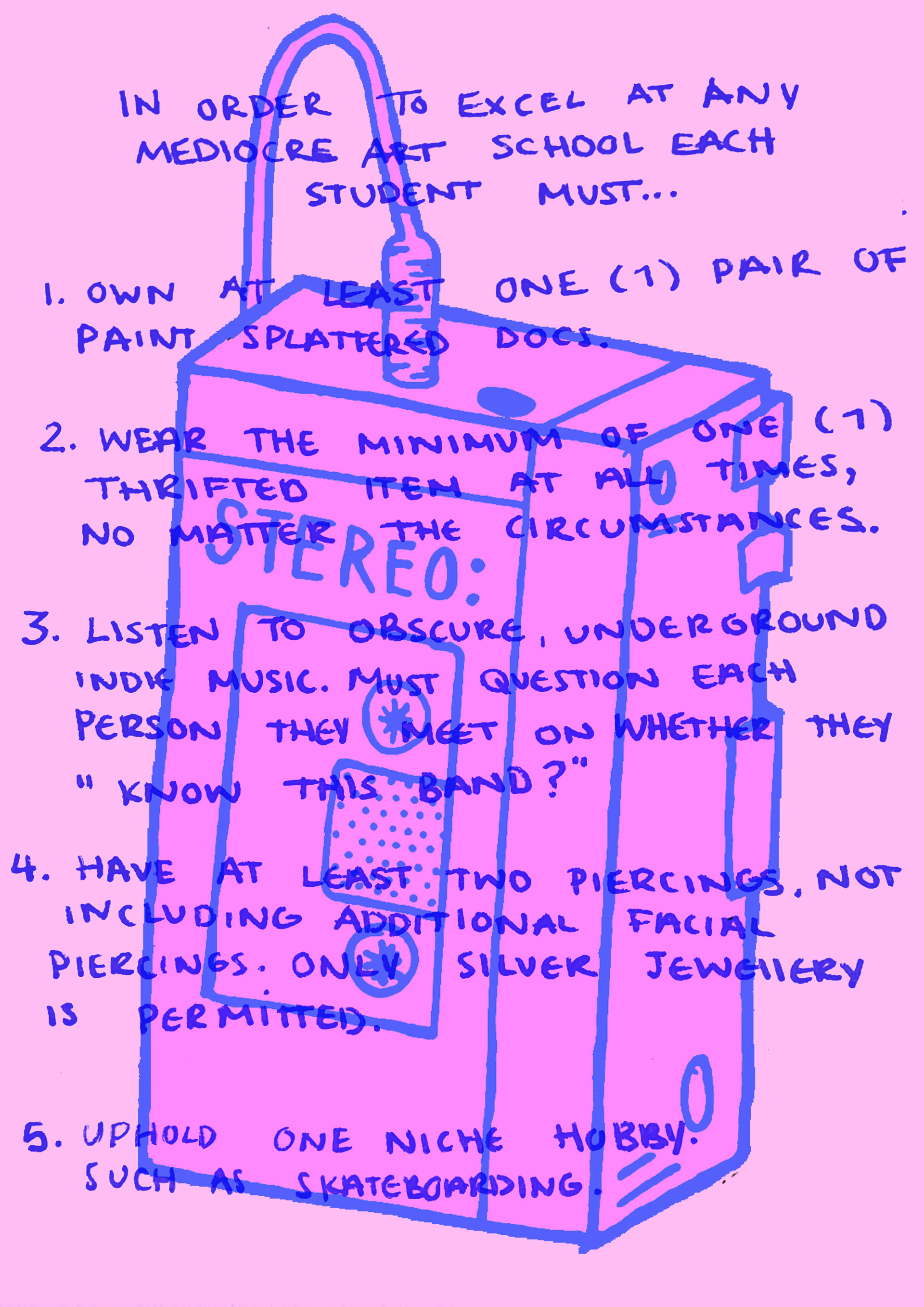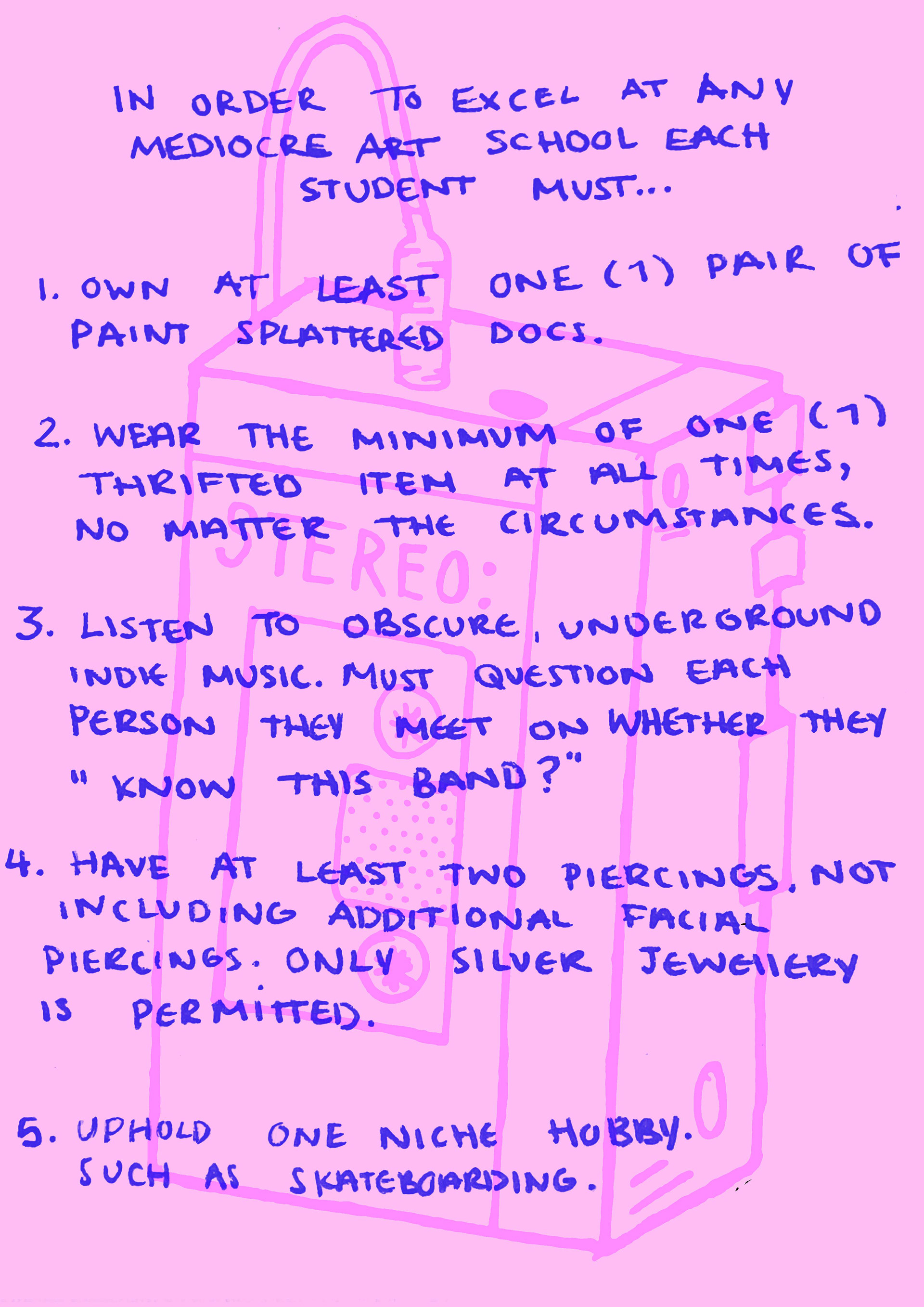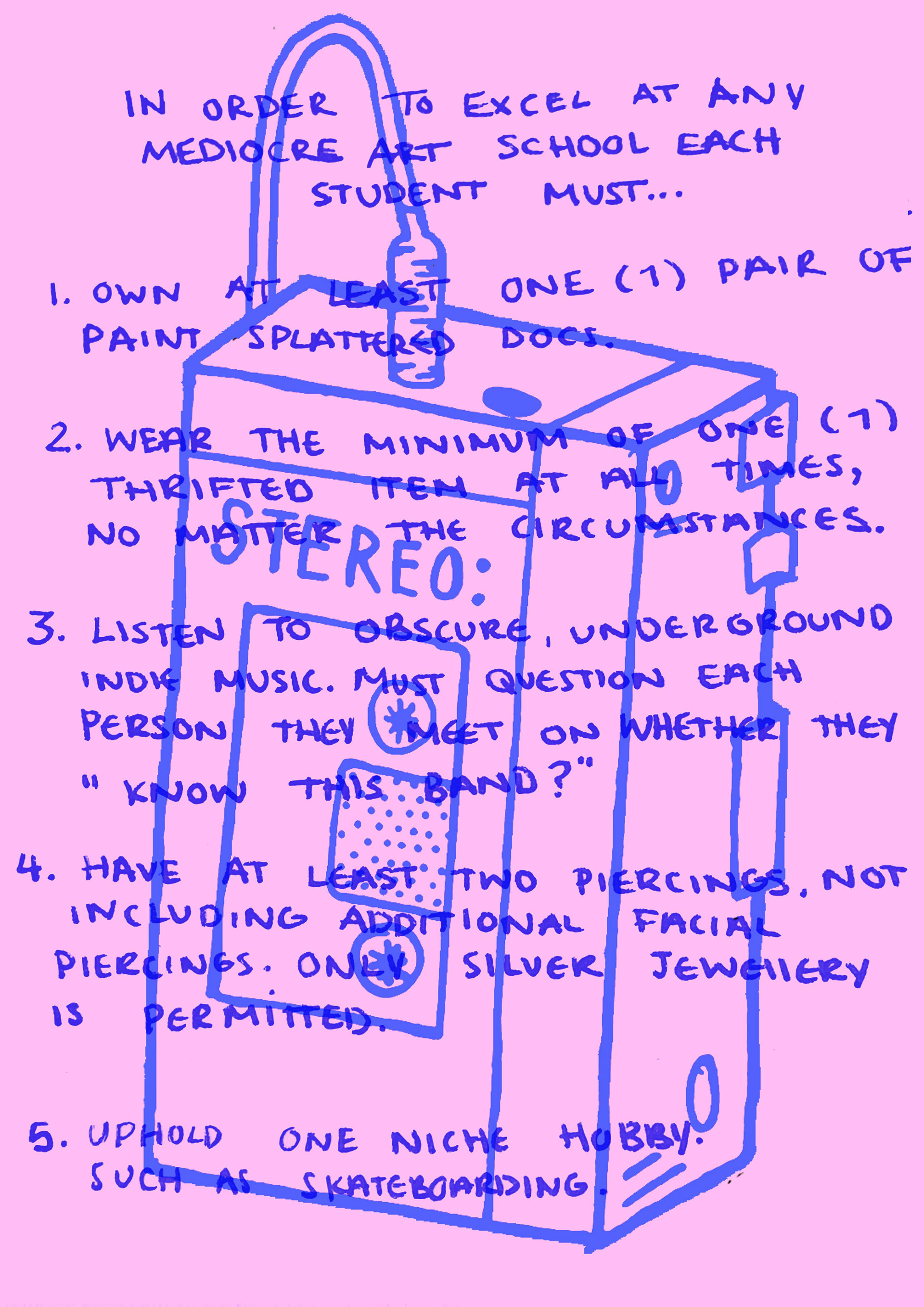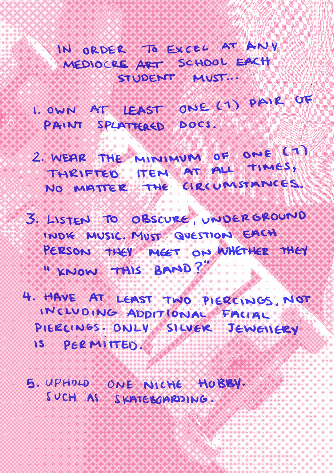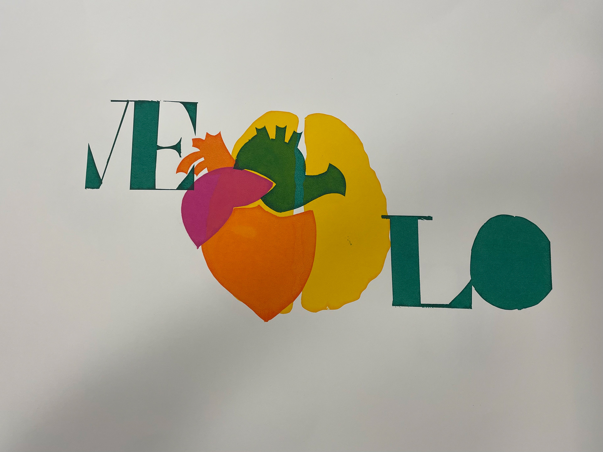
In my second semester at university, I had the opportunity to experiment with the Riso printer, a unique printing process that allowed me to explore vibrant, layered designs with a distinct, tactile quality. For this project, I wrote a manifesto that critically addressed the often-overlooked clichés of art school culture, aiming to challenge and deconstruct the conventional stereotypes associated with creative education.
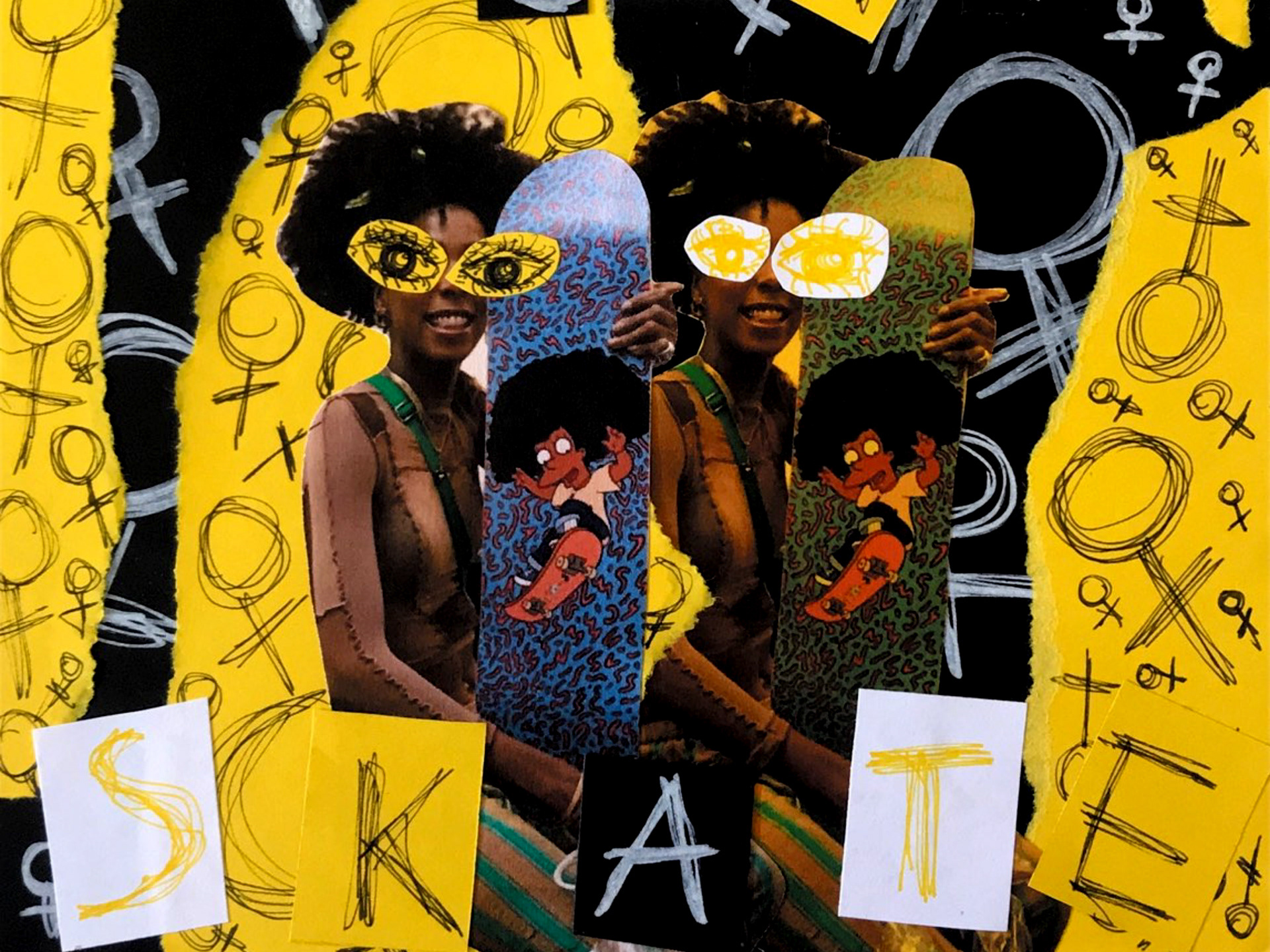
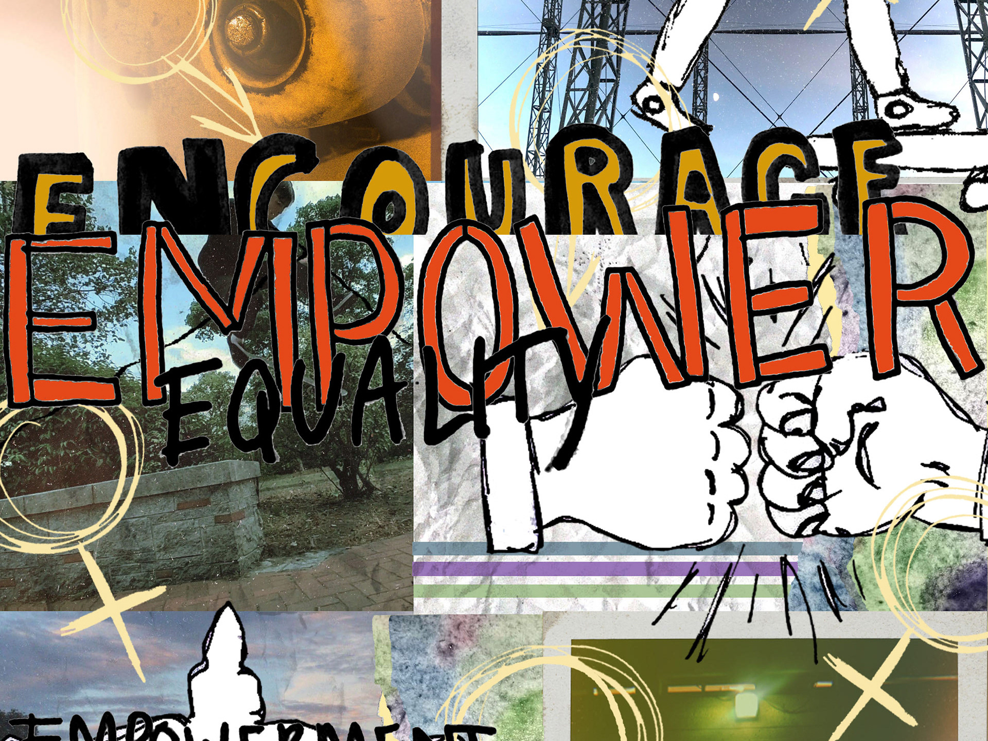
To bring this manifesto to life, I combined hand-drawn illustrations with carefully selected photographs, creating a visual narrative that complemented the tone and themes of the text. The illustrations were crafted with a sense of spontaneity and rawness, reflecting the creative energy of art school life, while the photographs added a layer of realism and context to the piece. Together, these elements worked to create a cohesive and engaging design that visually reinforced the manifesto's message.
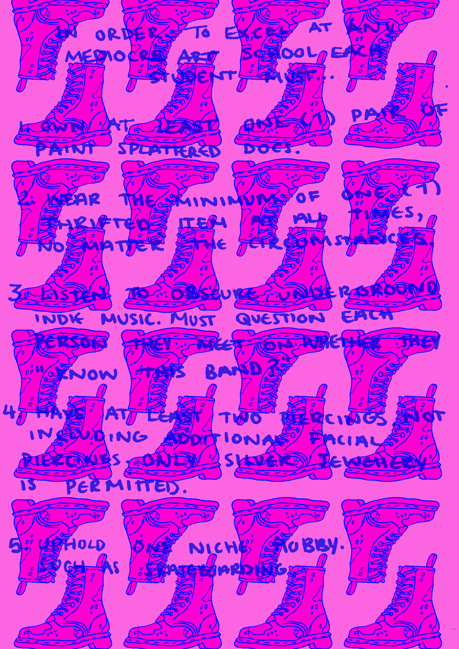
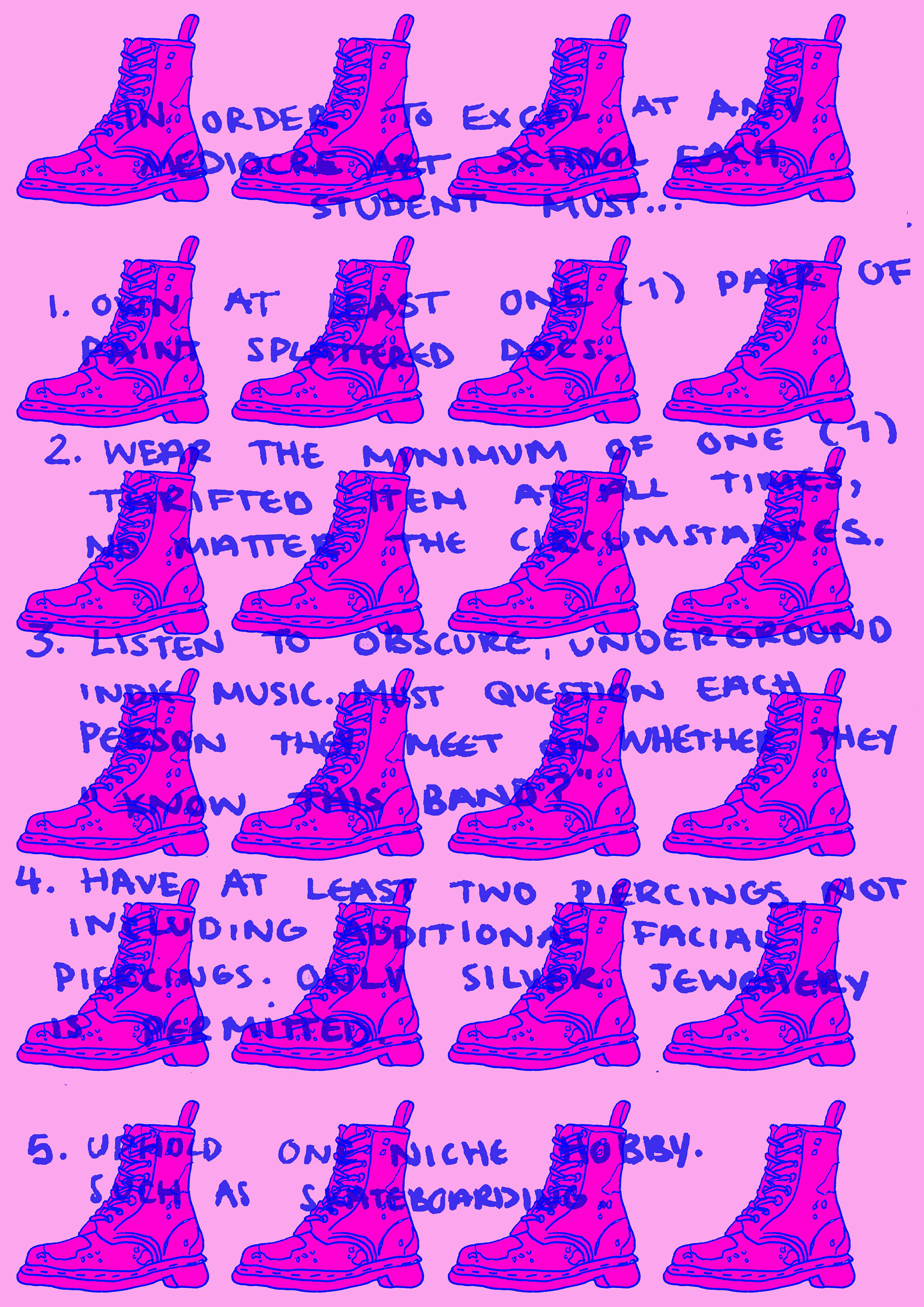
Throughout the project, I experimented with a range of designs, exploring different colour combinations and compositions to determine the most effective way to present the manifesto. The Riso printer’s unique colour layering process allowed me to push the boundaries of colour contrast, enabling me to create bold and impactful visuals that resonated with the manifesto's tone. I also considered how the interplay of typography and imagery would create a dynamic reading experience, ensuring that each design remained visually striking while conveying the manifesto’s critical message.
This project allowed me to explore both the technical aspects of Riso printing and the creative process behind conceptual design, offering a platform to critically engage with art school culture through a multifaceted, visually compelling piece.