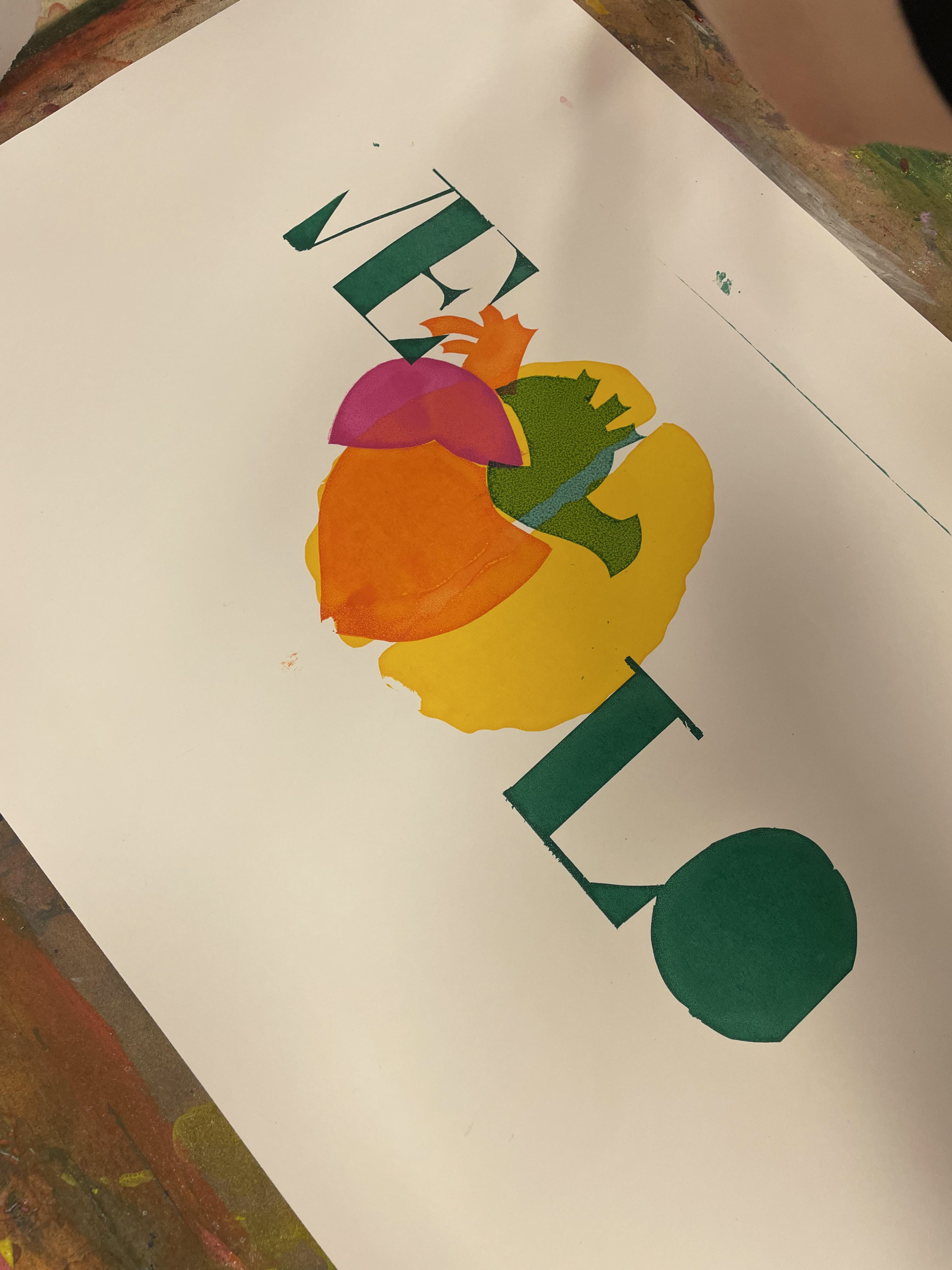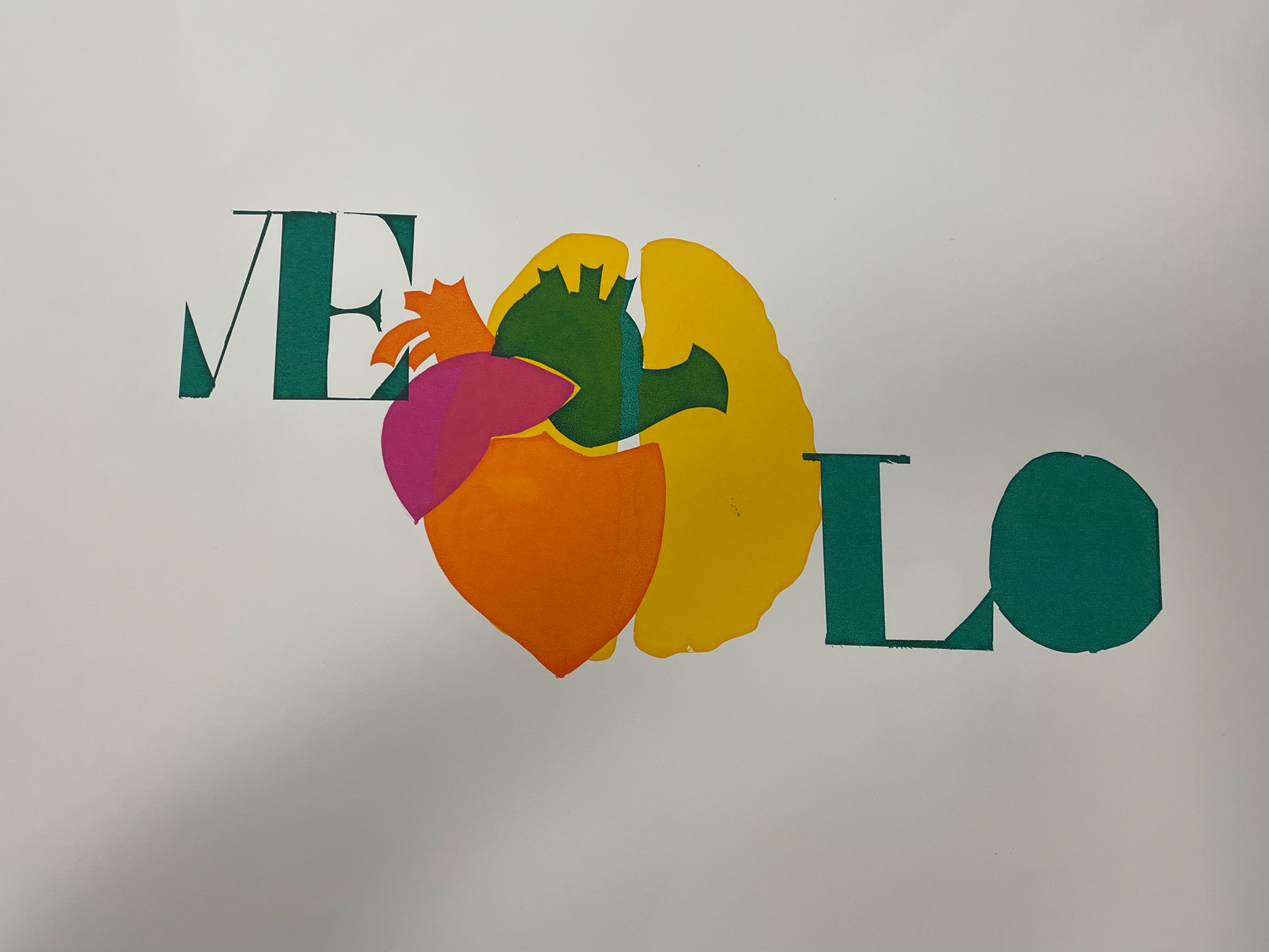
During my first semester at university, I was introduced to the process of screen printing, which provided a hands-on opportunity to explore the tactile nature of printmaking. For this project, I chose to focus on the theme of love and hate, aiming to visually communicate the contrasting emotions and complexities that define these powerful feelings.
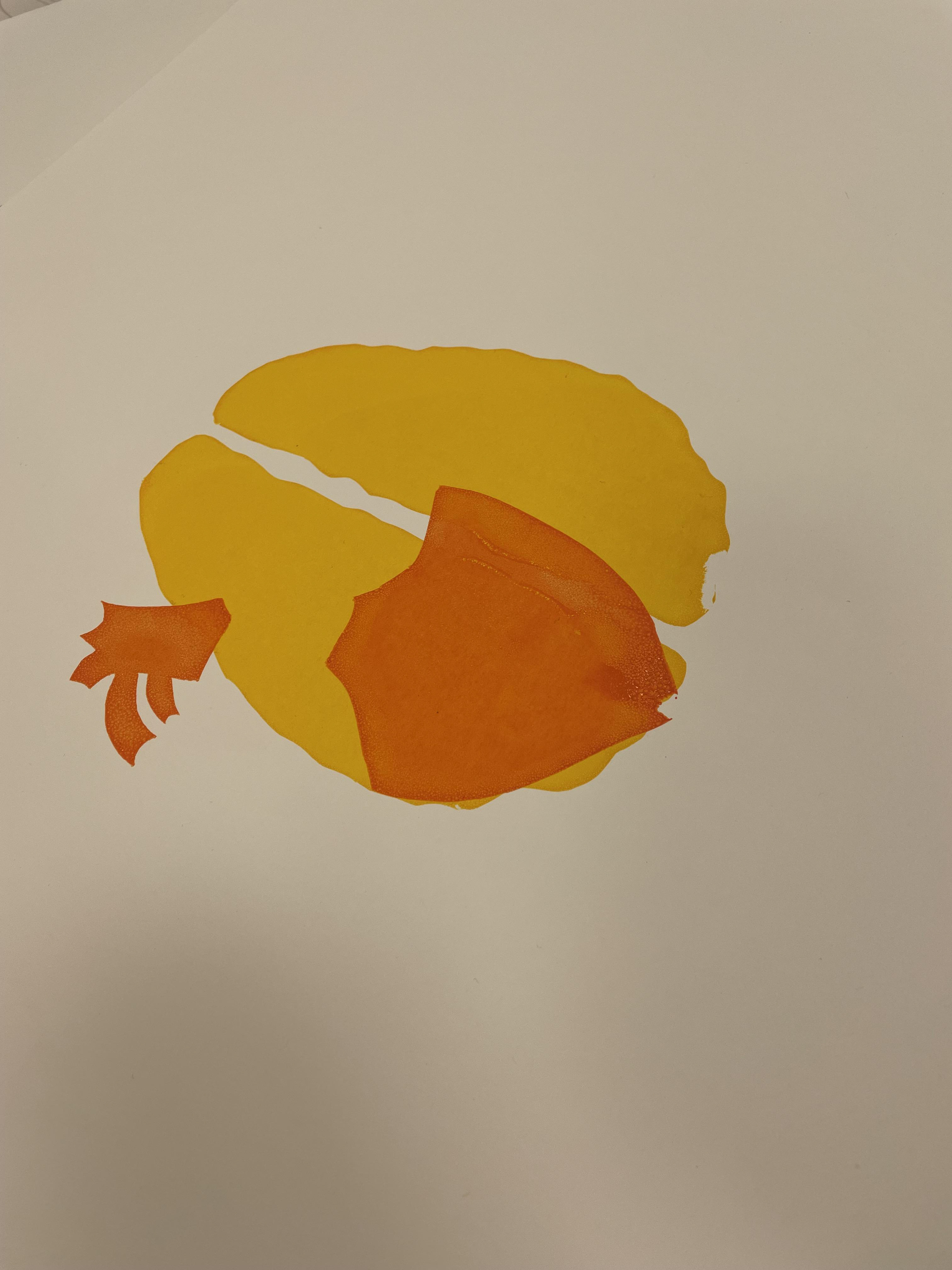
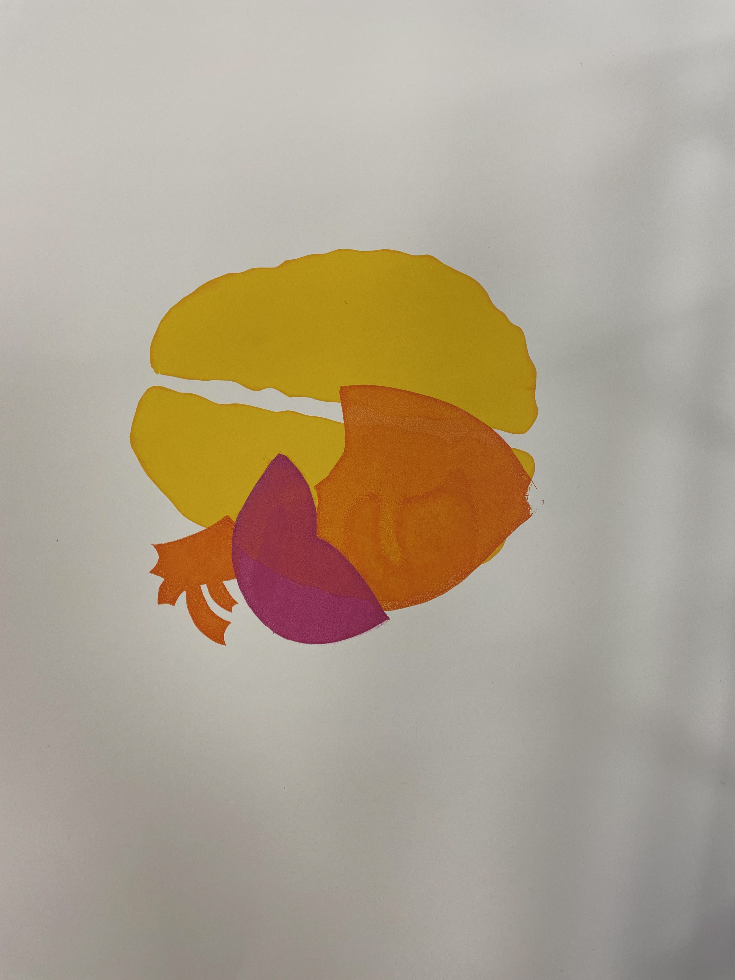
To develop my design, I combined carefully selected typography with a small illustration that symbolized the duality of the theme. The type was crafted with intentional emphasis on both its form and meaning, designed to evoke the intensity and emotional charge of the words themselves. The accompanying illustration was minimal yet expressive, serving as a visual counterpoint to the text while reinforcing the concept of love and hate as interconnected yet opposing forces.
Working within the limitations of screen printing, I focused on the interplay of positive and negative space, considering how the ink would interact with the texture of the chosen paper and enhance the visual impact of the design. The final piece aimed to create a striking balance between the written word and imagery, while reflecting the raw emotional energy of the theme through the physical process of printing.
This project allowed me to experiment with the screen printing technique, pushing me to think critically about composition, layering, and the way different materials interact in the creation of a final, tactile piece of art.